
Landing Page Experience
Product storytelling
| Commercial Inspired Range
Landing Page Experience
Product storytelling
| Commercial Inspired Range

OBJECTIVE
A vibrant brand reveal for KitchenAid's commercial inspired range.
Role | Lead Digital Designer
Conceptualized, pitched, and executed design solutions from launch to live.
Fully integrated collaboration with client, copywriters, strategists, developers, cross-agency producers, and product engineers to create impactful user-focused solutions. Managed brand priorities while being mindful of budget, timeline, and restrictions. Created accessible, mobile-first AEM solutions, from immersion to implementation.
Pushing brand conversation with emotionally-driven story architecture and evergreen components.
Agency | Aisle Rocket (Chicago, IL)
2019
Design
Nicole Engle
Chelsey Dever
Copy
Aaron Adams
Development
Adam Klemm
Chet Farley
Strategy
Joe Brodicki
Account
Jenna Halgen
Tess Babbit
Sarah Senour
View the live experience


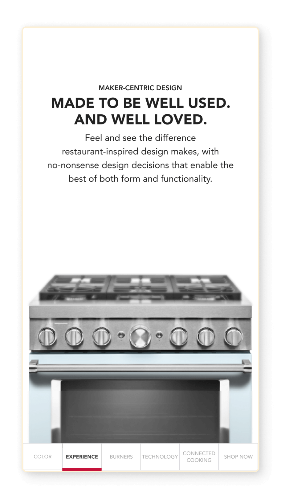
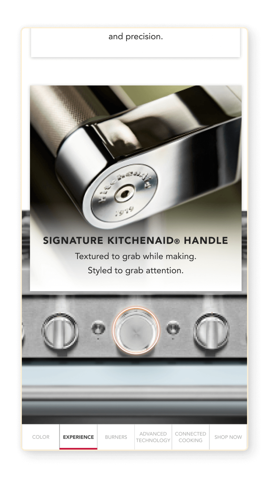
PROCESS
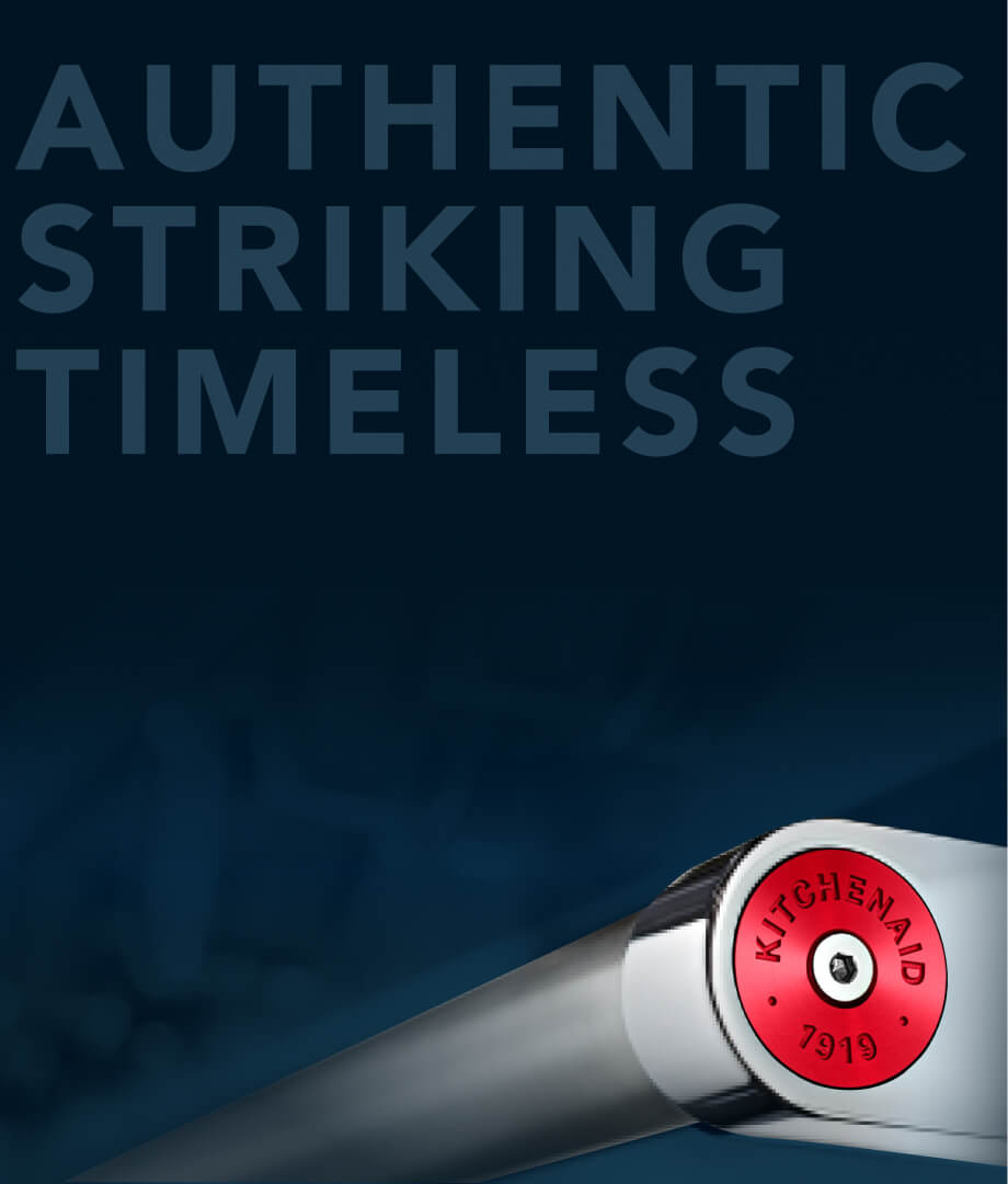
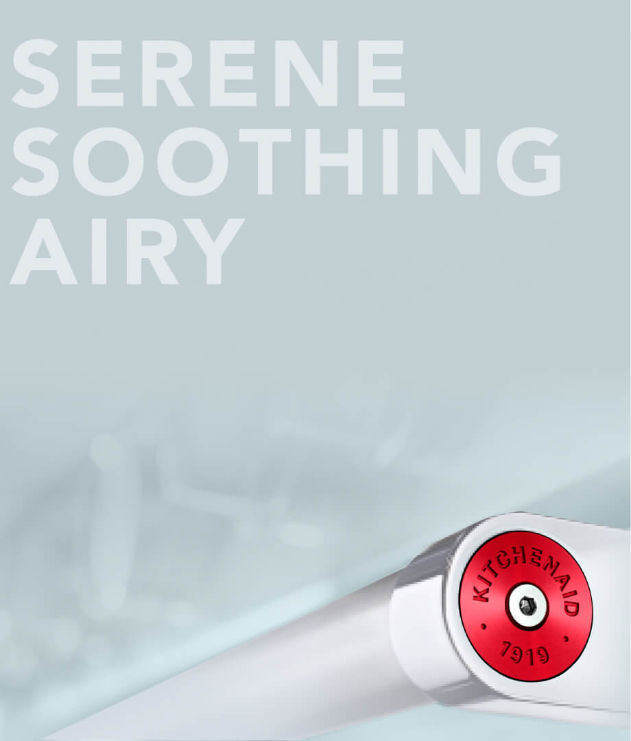
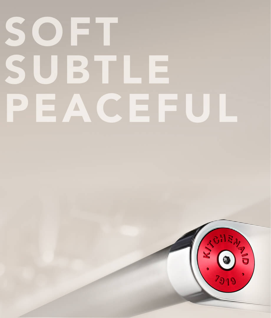
Balancing
color story and functionality.
Amplify the brand essence, beyond countertop appliances.

Strategic information architecture
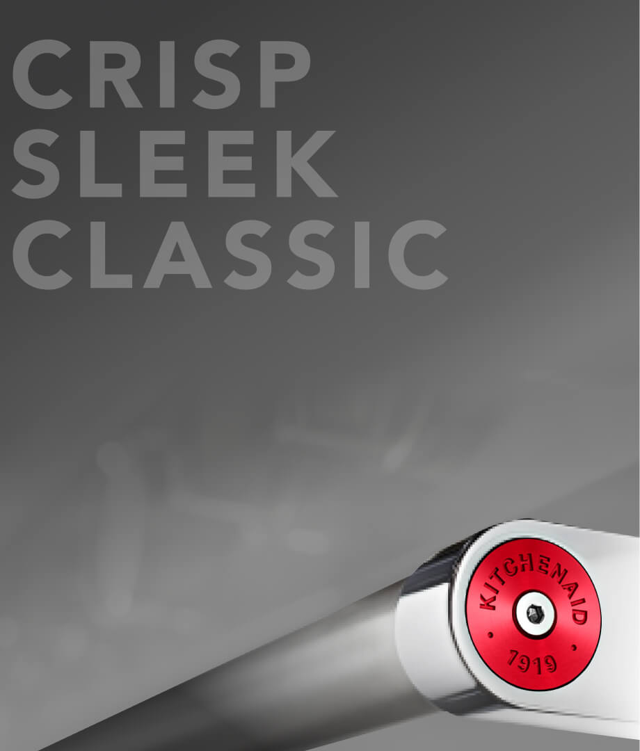
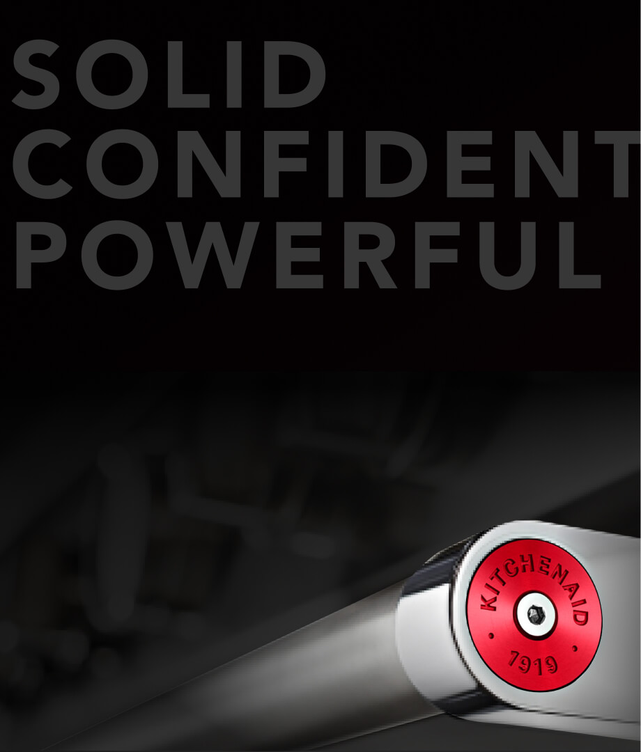
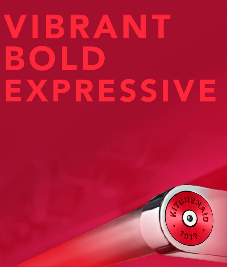
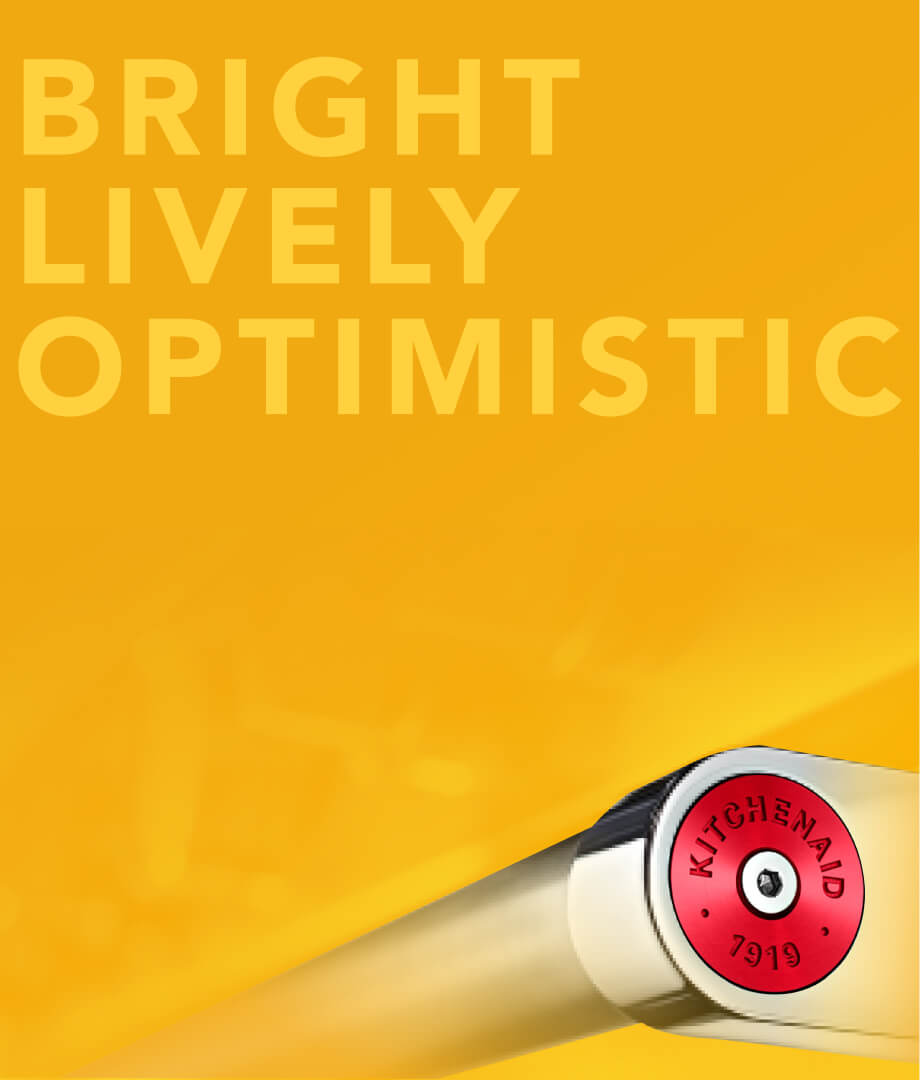
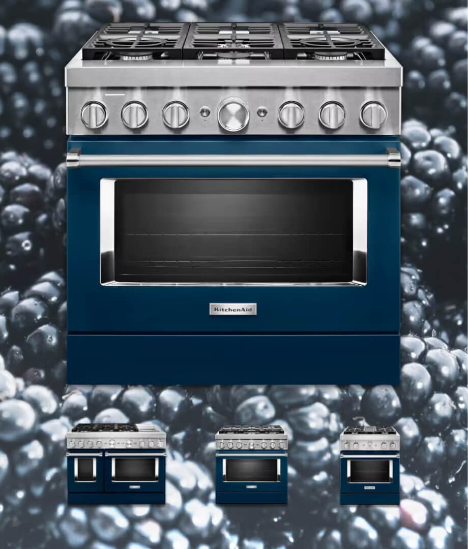
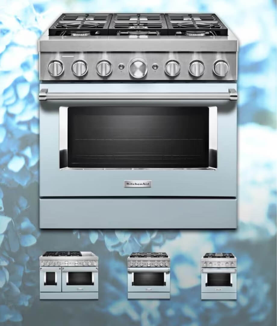
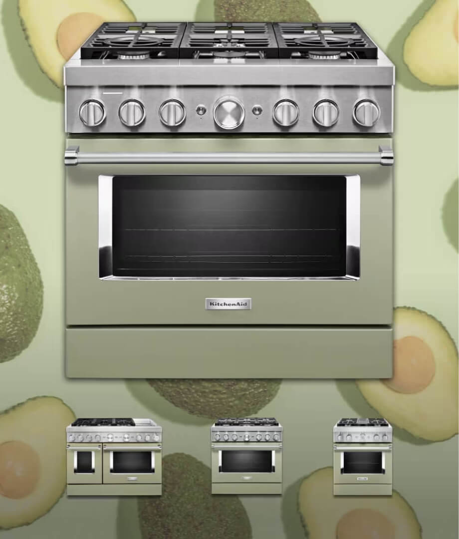
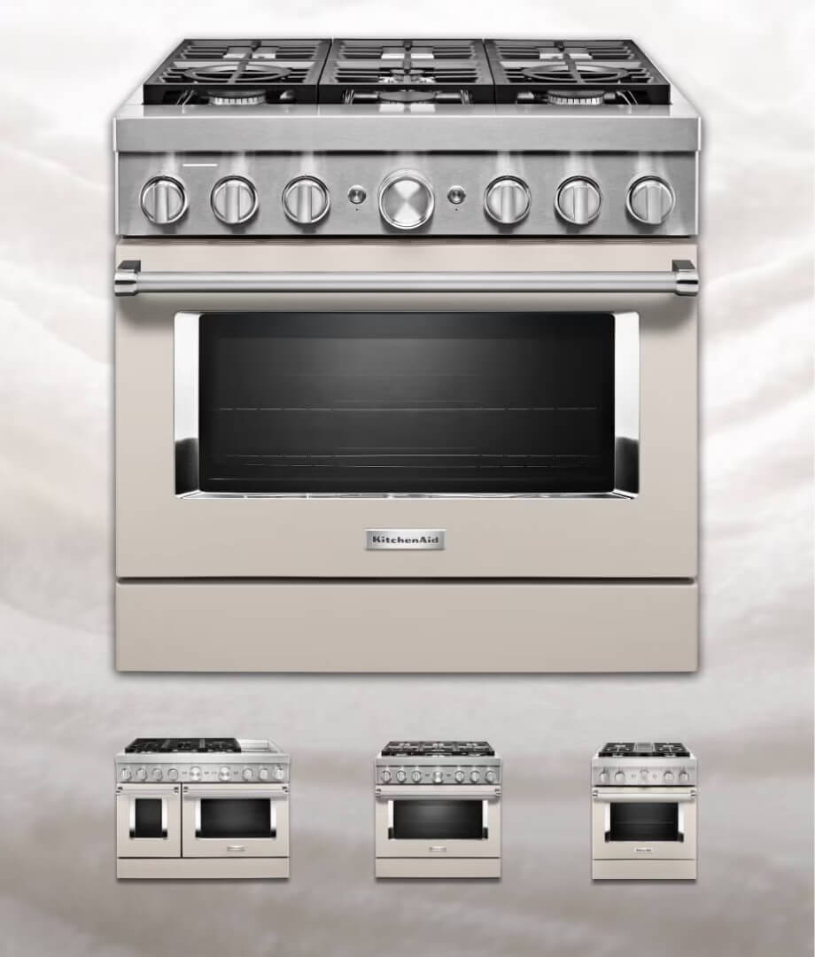
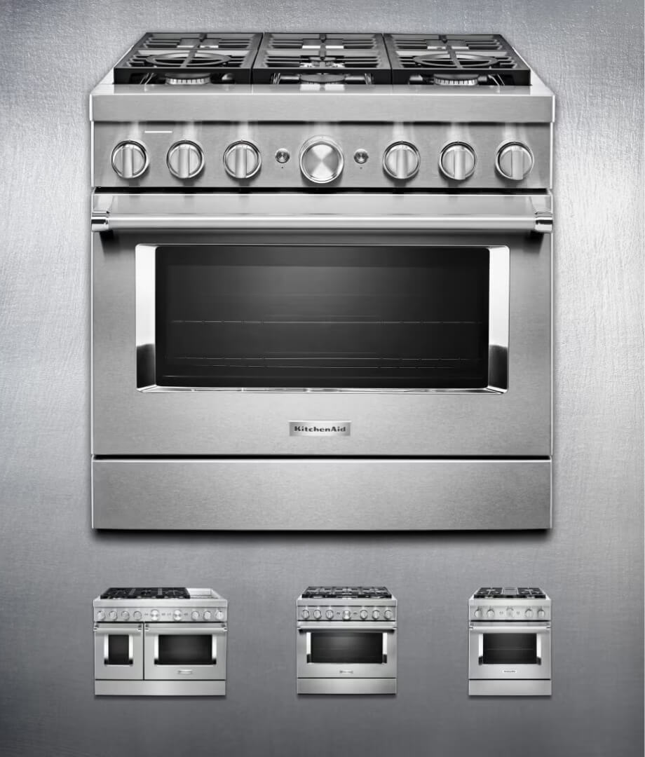
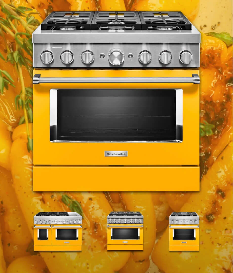
Reimagined user-centric concepts balance an extensive color story while understanding user’s unspoken needs beyond appearance: culinary exploration that aligns with their lifestyle.

Versatile components built with high-impact visuals and thoughtful interactions, align with dev budget and strategic goals. A driven foundation of feeling and function that can be repurposed and easily revamped for product launches at a later date.
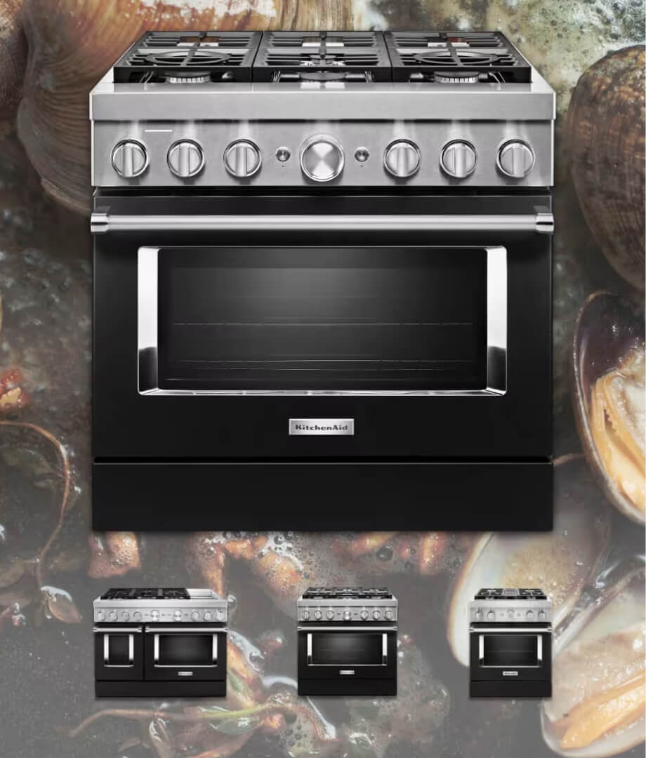
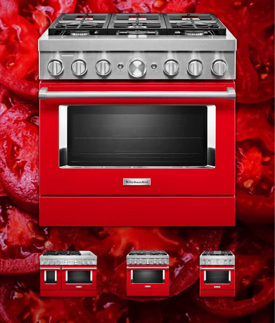
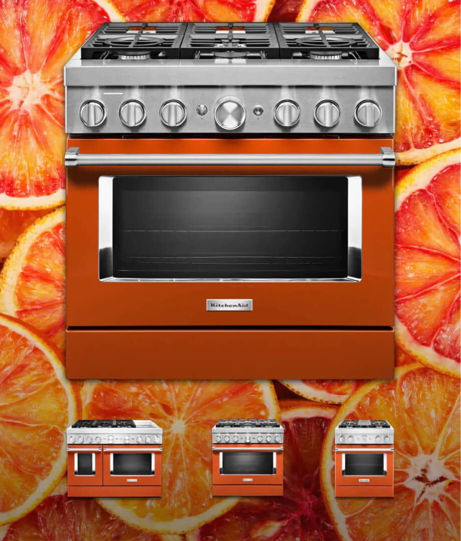
Bold brand moments
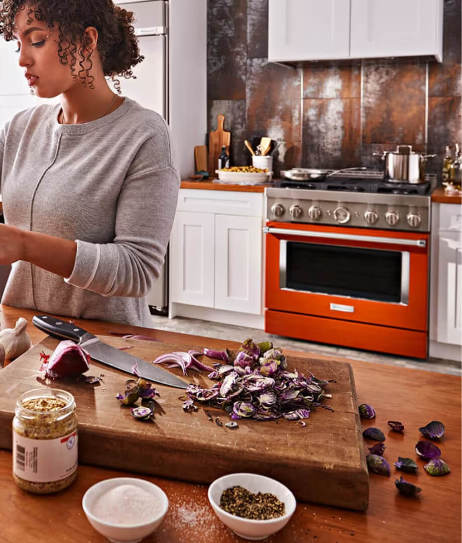
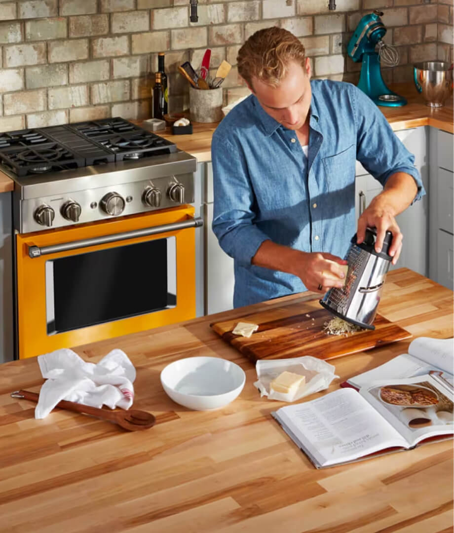
The user is immediately immersed by irresistible interaction with color – like being a kid in a candy shop. A sense of joy and curiosity, hooked into a world where the kitchen can be an opportunity for sensory exploration and excitement.
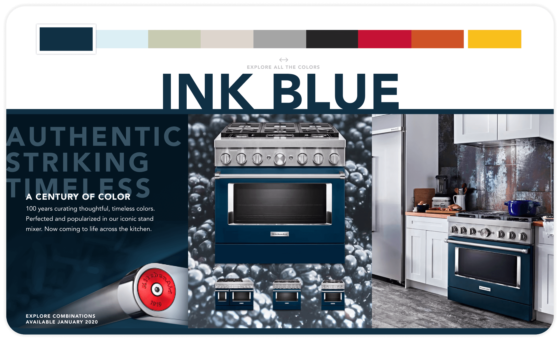
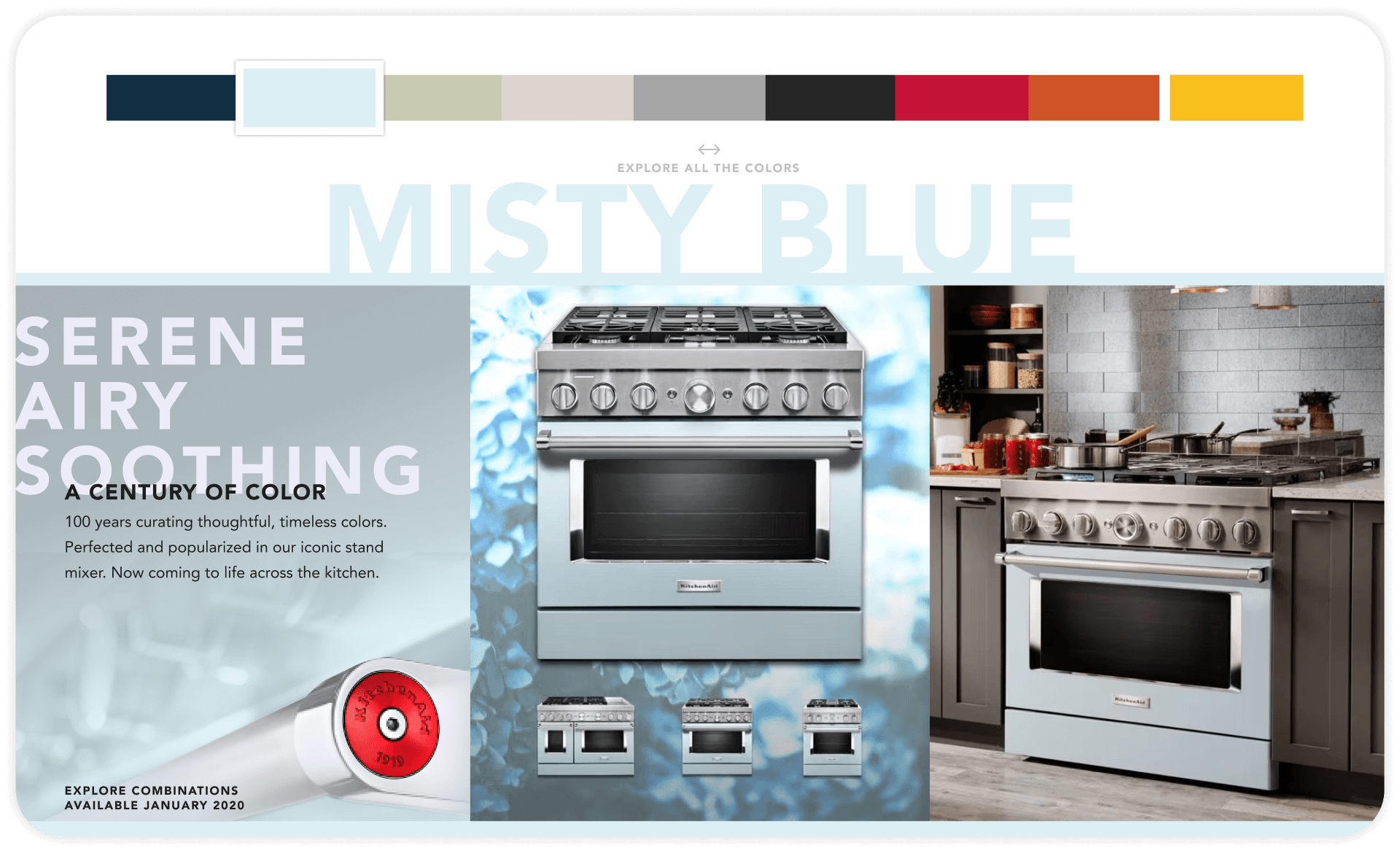
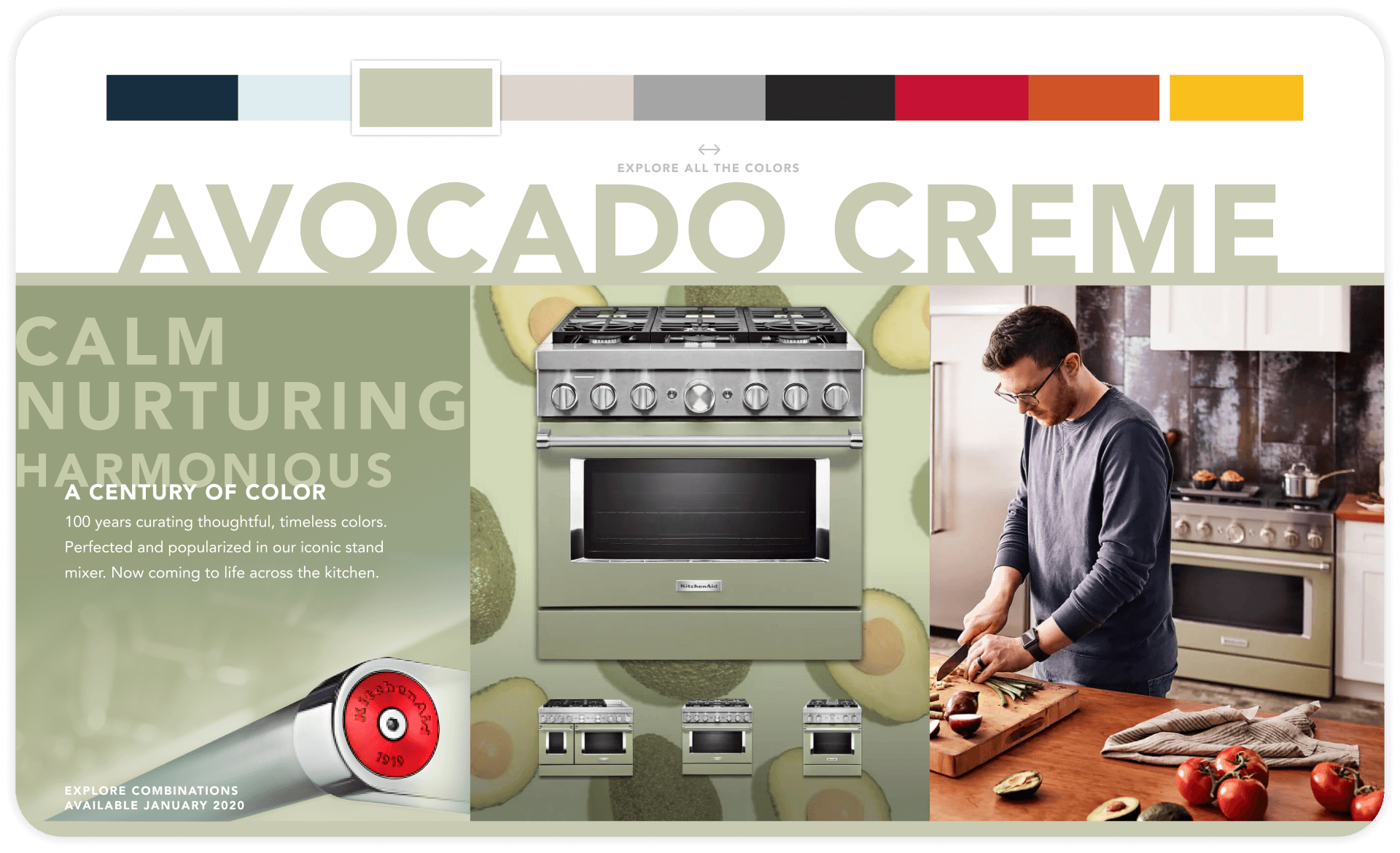
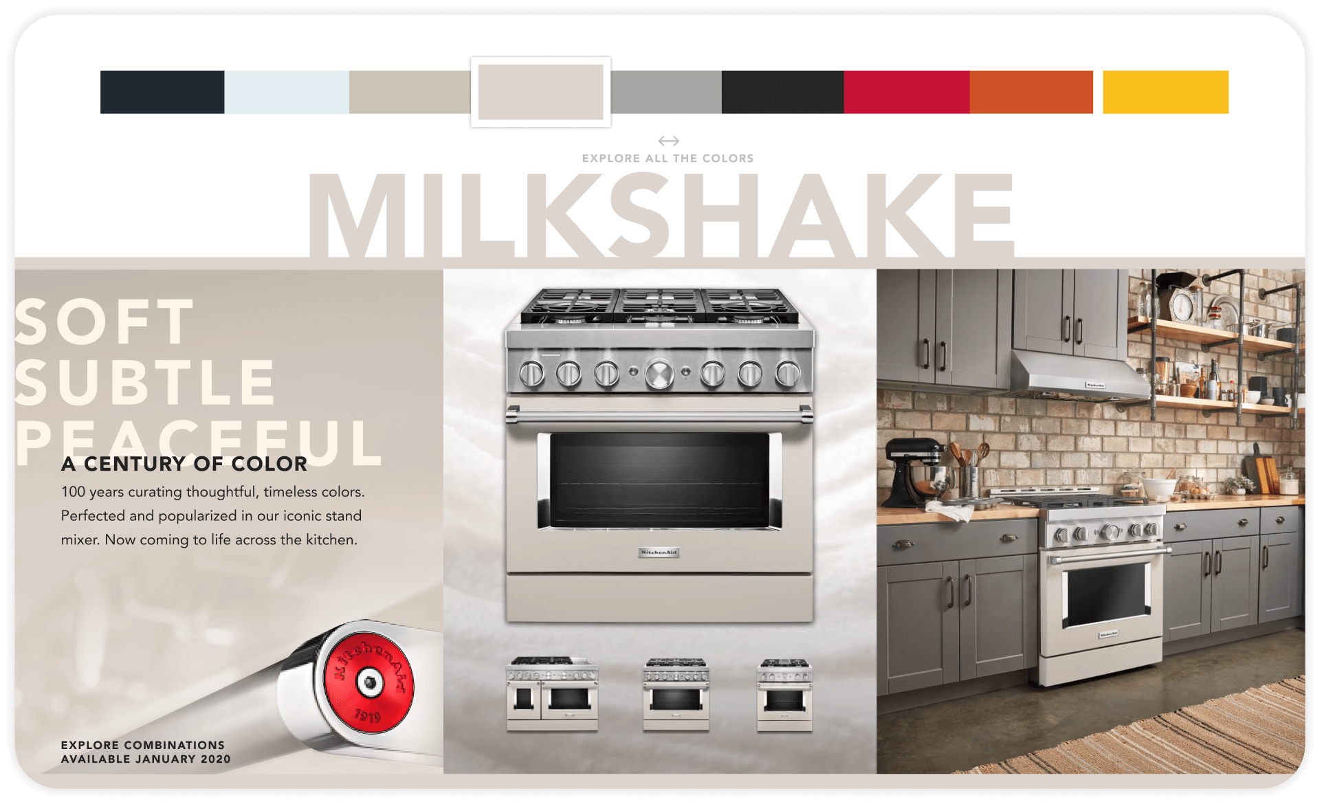
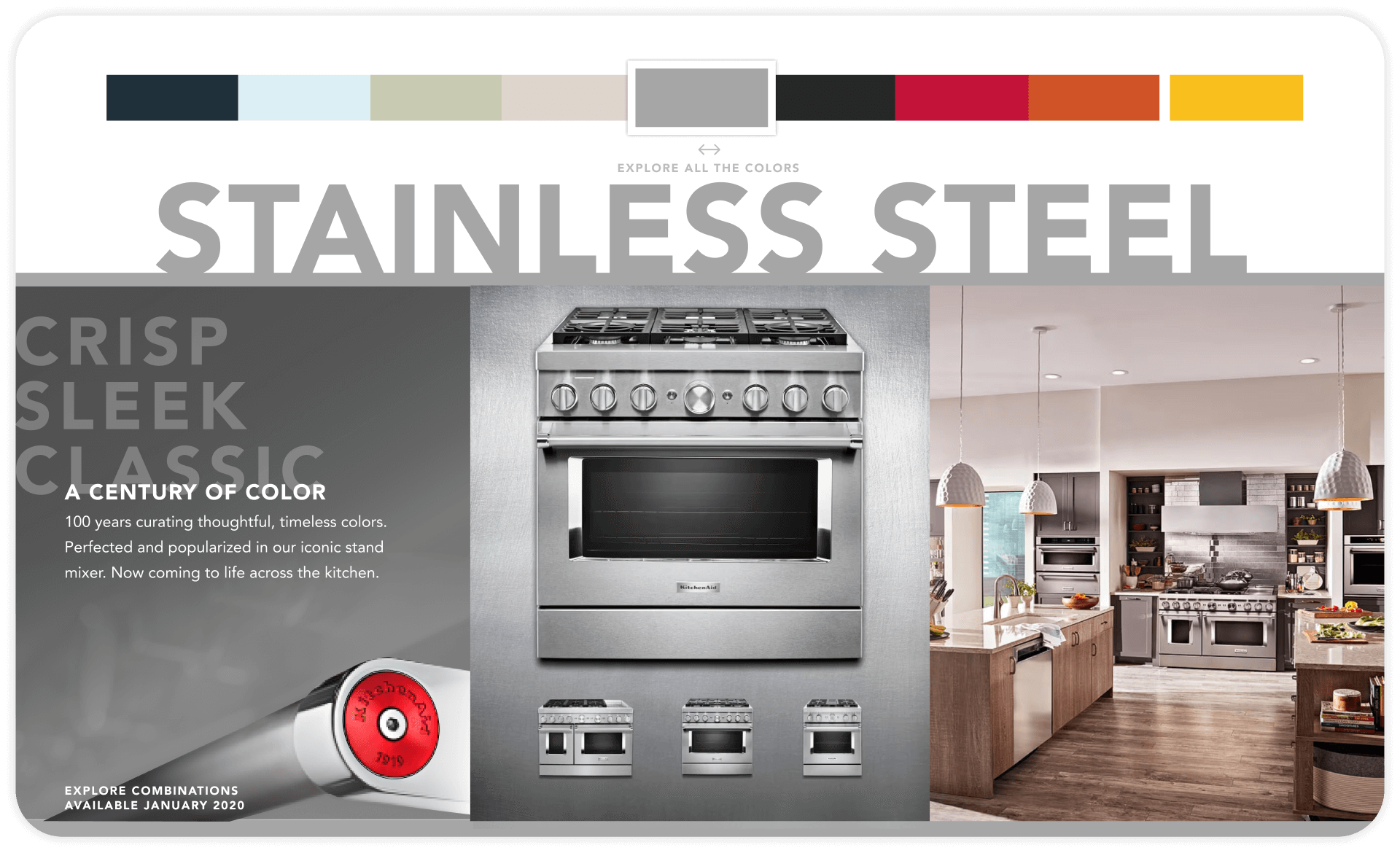
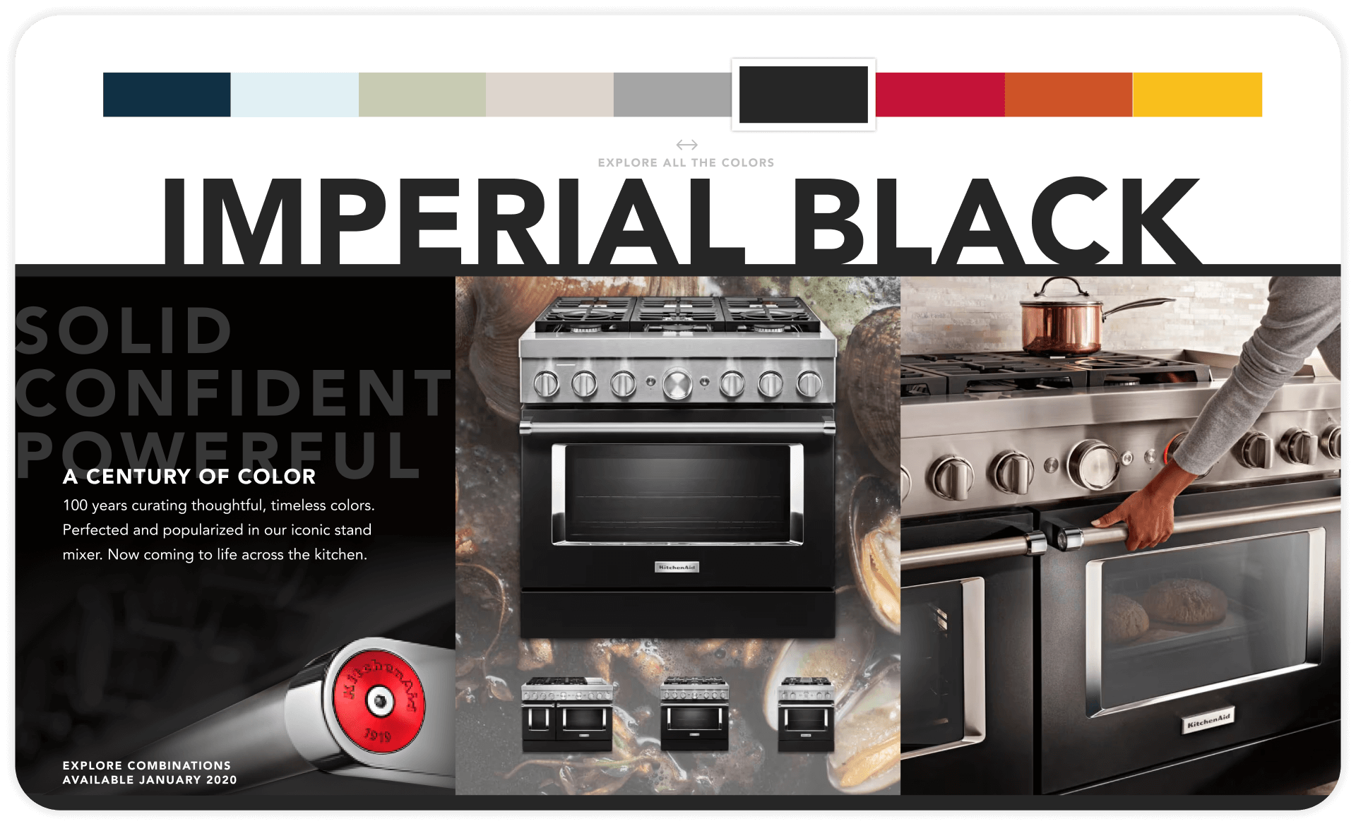
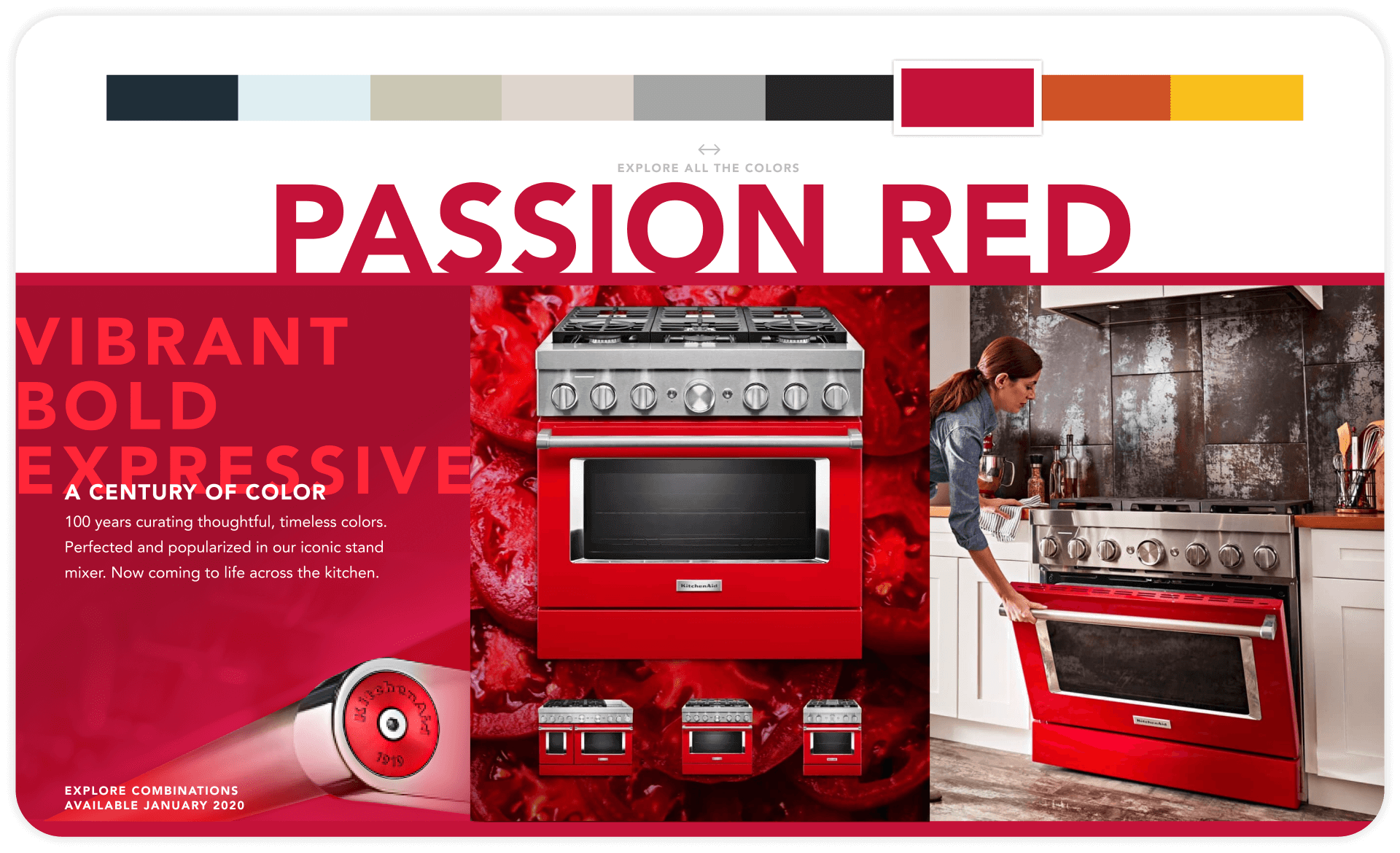
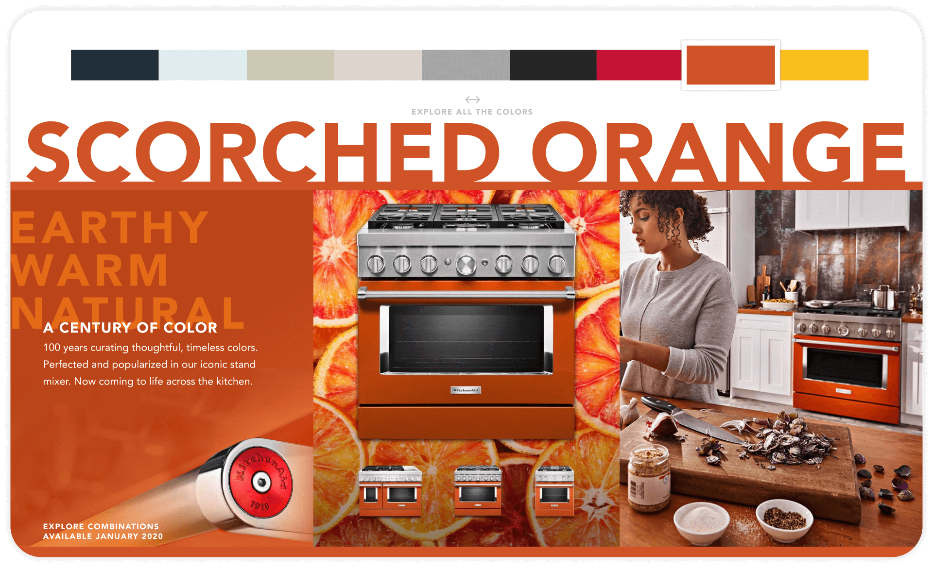
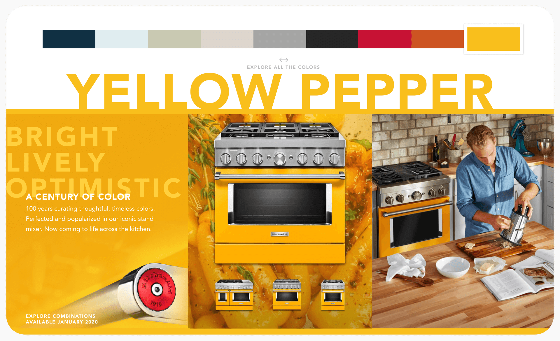
Strategic eye catching vignettes articulate original inspiration behind each color, associating bold hues with impactful flavors and memories.
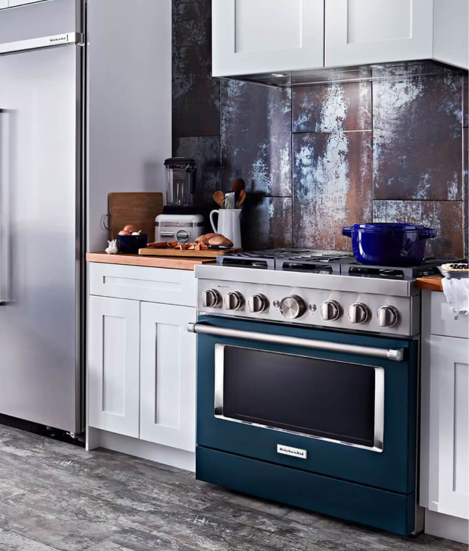
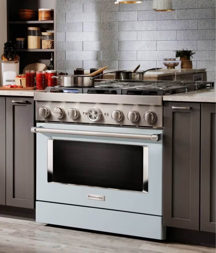
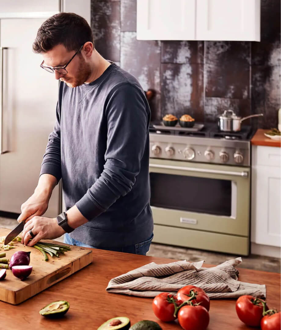
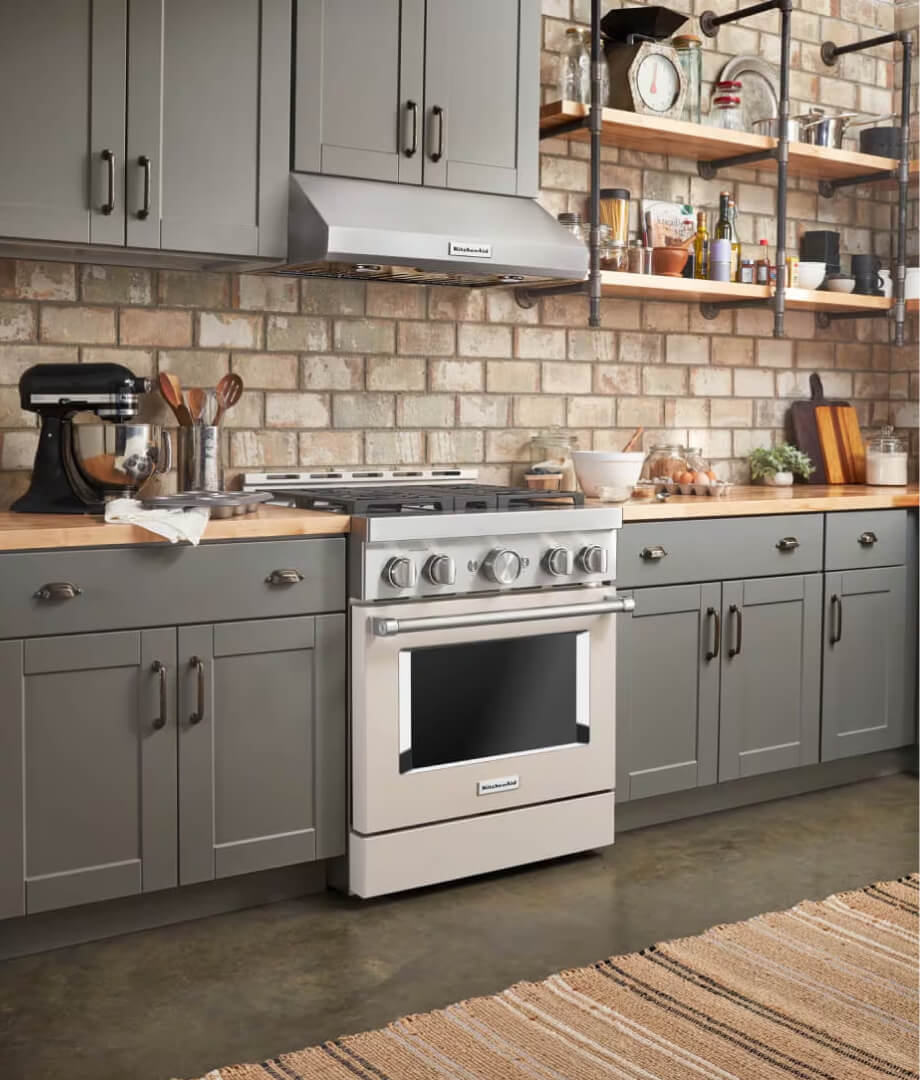
Paired with approachable images of the product in use – empathetic towards the user’s hue hesitation. An invitation to imagine possibilities without an entire kitchen redesign – inspiring the user to experiment with finding their own stylistic voice.


ACCESSSORIES
Signature medallions
INSPIRATION
Via cross-channel collaboration
ASPIRATIONAL SCENE
Make bold palatable!

Additional messaging
in post-live updates
The KitchenAid brand team needed the ability to highlight the signature swappable Medallions line after go-live without disrupting the hierarchy of the product’s messaging.
Incorporated still-evolving details and specifications for the Medallions line — including new rose gold and cobalt blue colors, an updated logo mark, and more.
Digestible product details
The colorful stand míxer’s trustworthy design, unmodified since 1900. User loyalty was built on much more than an expressive exterior. A user-focused solution amplifies the iconic brand mindset beyond small appliances, articulating product features in a digestible mobile first solution.
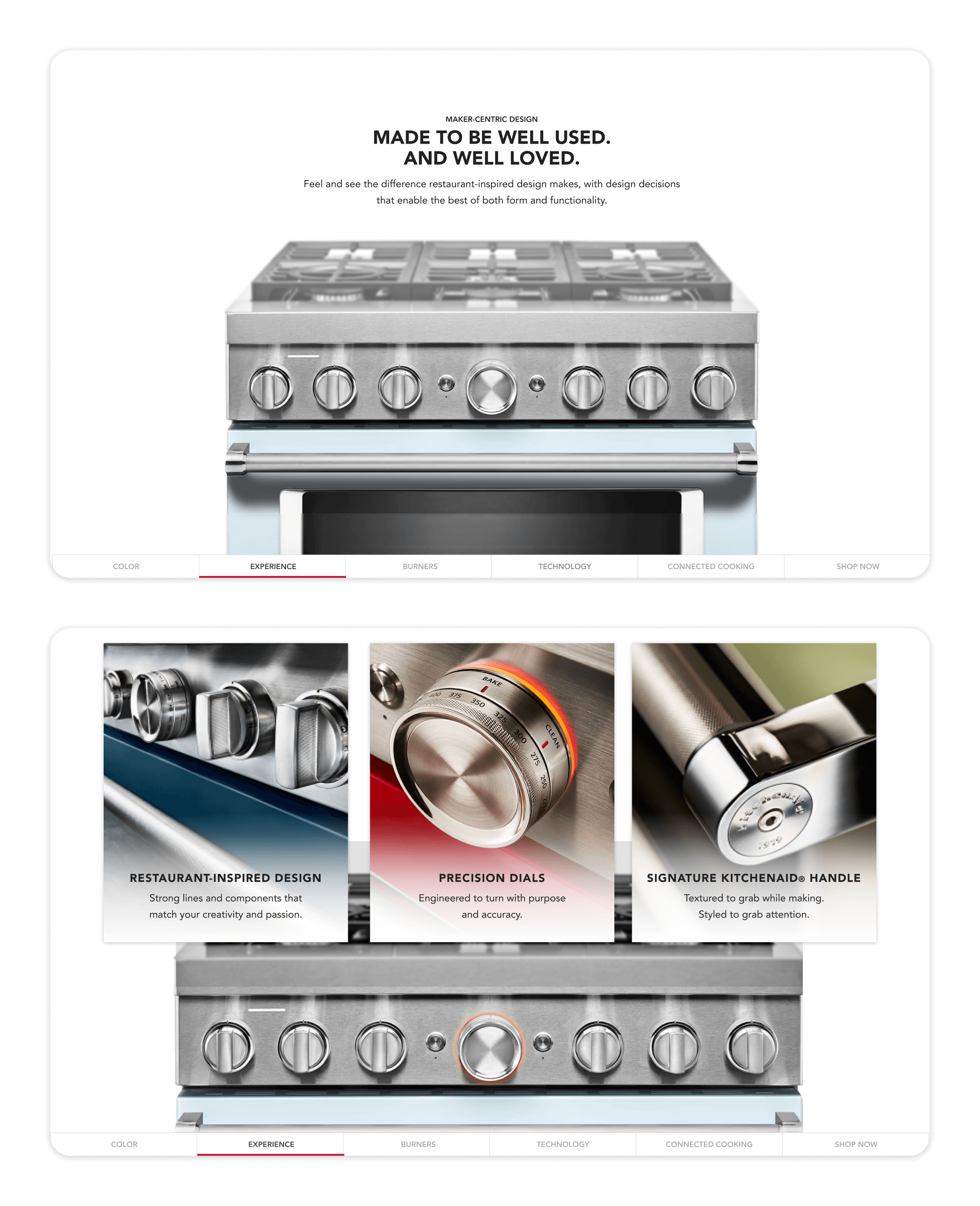
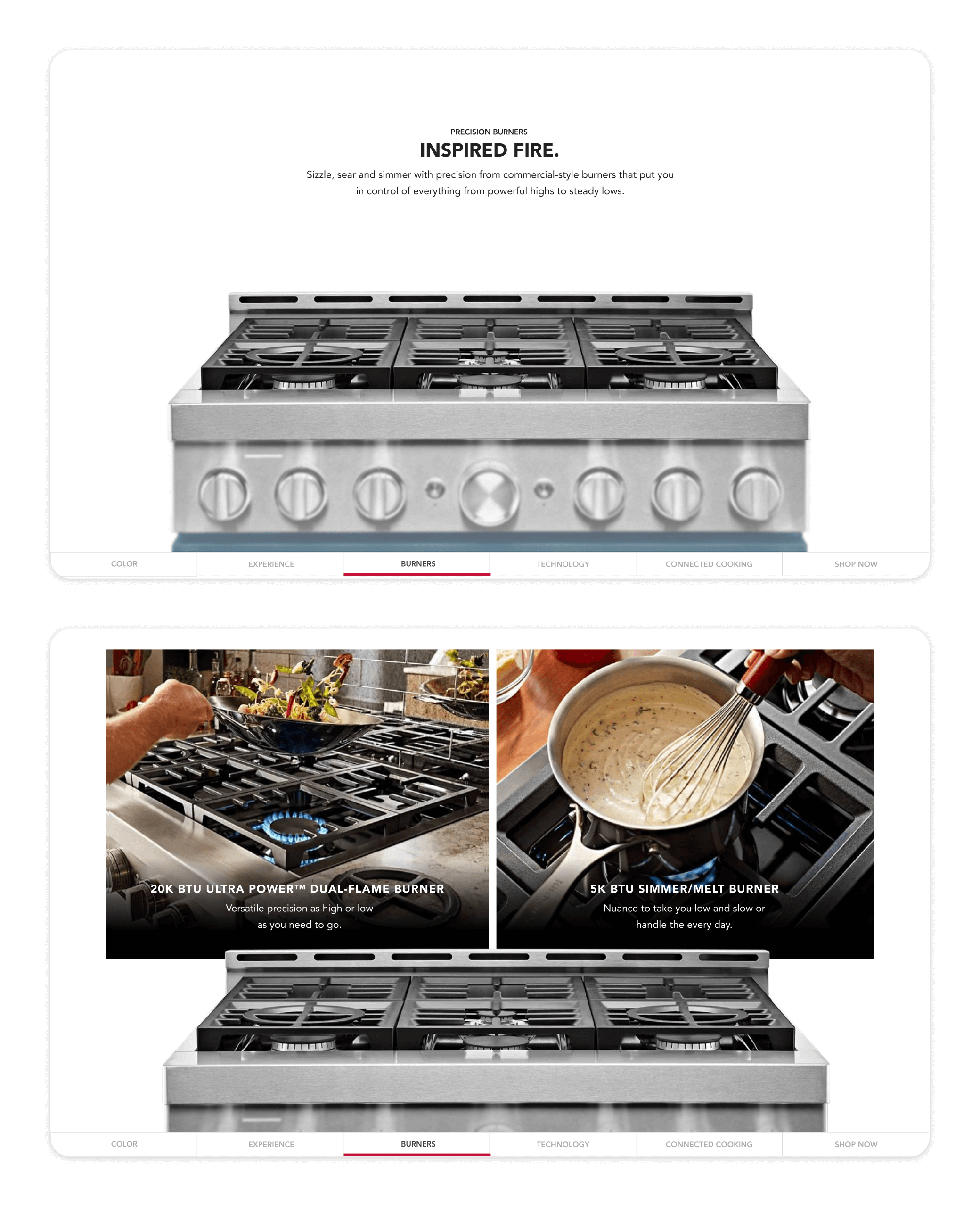
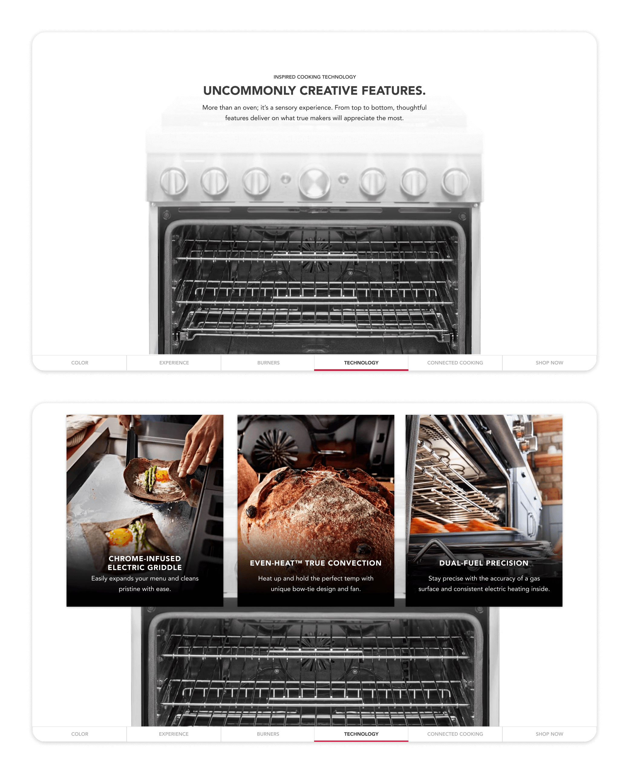
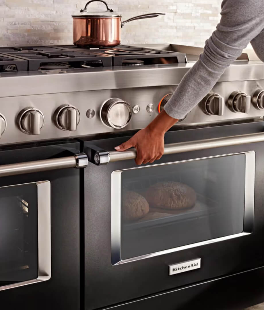
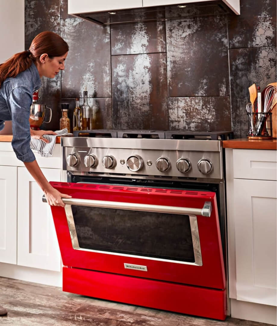
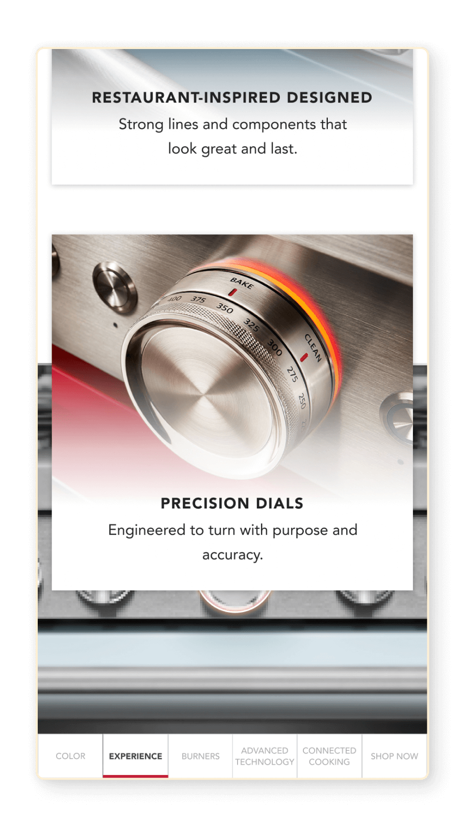
As if examining the range from top to bottom, the elevated customer experience guides you visually through each section of the product – look and feel, burners and oven features. The isolated image thoughtfully paired with overlapping cards of information present possibilities through a linear scroll sequence of paired with feature action shots.
Components tailored for impact
Added flare to the AEM out of the box “Shop all” component by incorporating brand cohesion and adding visual support.
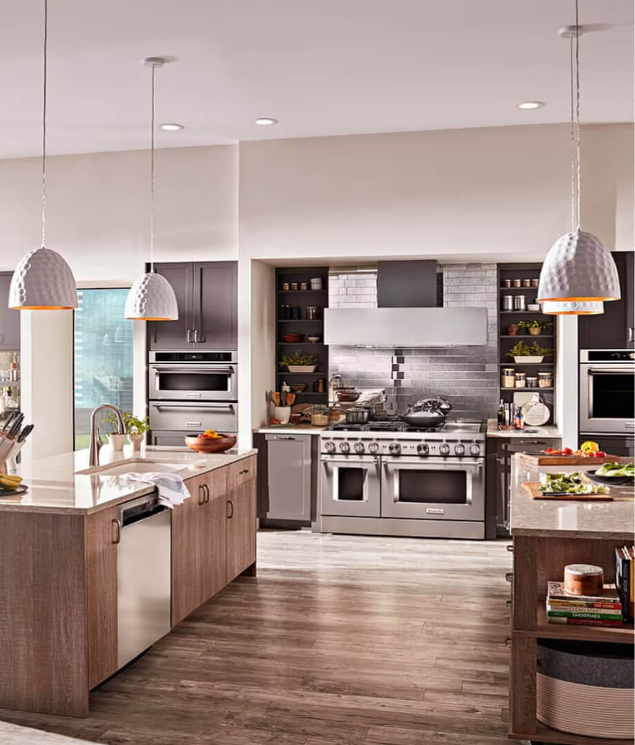
Supported the effort to visualize how colorful appliances would look in users’ spaces by prioritizing lifestyle settings and scenes.
Worked closely with brand photography teams through communication and implementation of available assets. Added clarity and direction for photoshoots — including the preferred responsive friendly aspect ratio, product angle, and lighting to reinforce the unified goal of visualizing a product color in a space.
Those priorities then became a reusable standard for future storytelling needs for a variety of product types, unified in brand differentiators for inspired colors.
Also added the ability to order color swatches for users considering purchasing the commercial inspired range but were still unsure if the color would work for their space.
RESULTS | POST LAUNCH METRICS
Establishing the brand as the authority on color.
TRAFFIC | ENGAGED BELOW THE SCROLL
56%
KPI Interaction
*Post-launch insights presentation, Aisle Rocket.
“Doing some heavy lifting for KitchenAid as the authority on color; based on the user color swatch interaction”
SDA SHOPPER AUDIENCE
64%
PDP click thru
*Comparing MDA and SDA (Major/Small Domestic Appliances) shopper audiences. Post-launch insights, Aisle Rocket.
5.91
Avg. PDP View per Visit
+15%
ATC Rate
0.94%
Conversion Rate
IMPACT
3rd in Prophet’s Brand Relevance Index
“Best in 'lives up to its promises', climbing to #3 from #6 overall"
What makes a brand relevant?
MORE FEATURED WORK


LET'S CONNECT
NICOLE ENGLE
UX, UI, CX Designer
Specializing in ecommerce solutions.
Currently creating in Chicago, IL.
