Category Level Experiences
Legacy Brand Ecommerce | Stand Míxers, Attachments and Blenders
Category Level Experiences
Legacy Brand Ecommerce | Stand Míxers, Attachments and Blenders
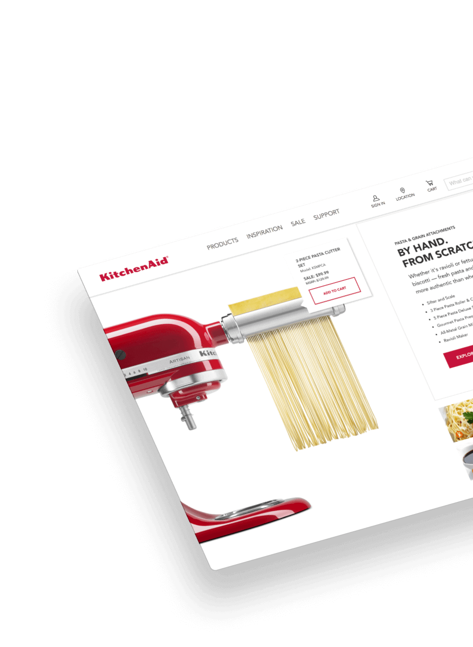
OBJECTIVE
KitchenAid D2C product category experiences
Role | Lead Digital Designer
From concept to execution – ideation, wireframe, art direction, imagery, production, QA – as well as constantly evolving with direct client input and strategic messaging edits.
Constant collaboration across agencies, in-house developers, photographers, product manufacturers and engineers, and point-of-purchase brand in-store team.
Researched customer needs and shopping experience expectations, competitive analysis of an array of brands – going above and beyond expectations with KitchenAid’s unique brand authority.
- Foundational storytelling established by translating product details into strategic brand goals.
- User-focused information architecture to expand product education, cross-promote products, and amplify brand presence.
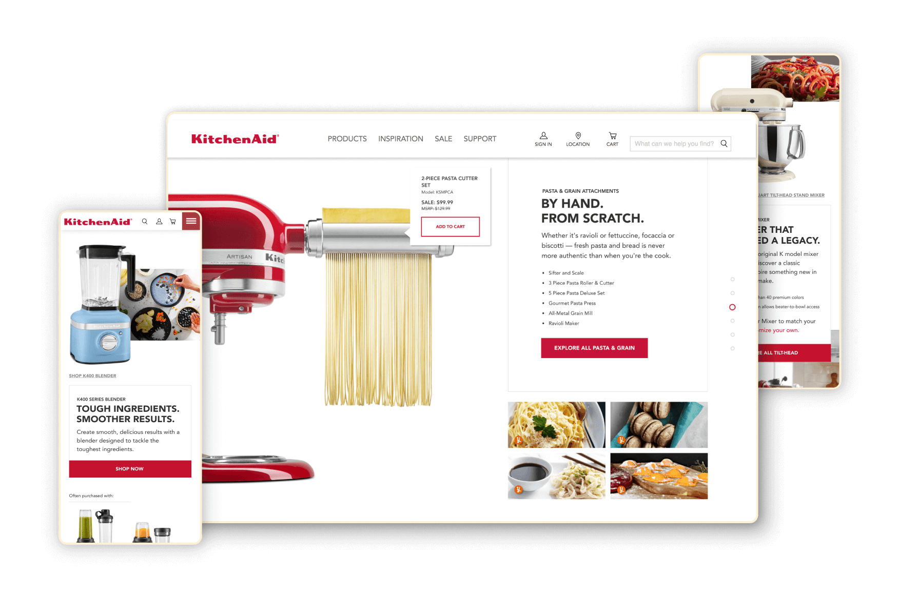
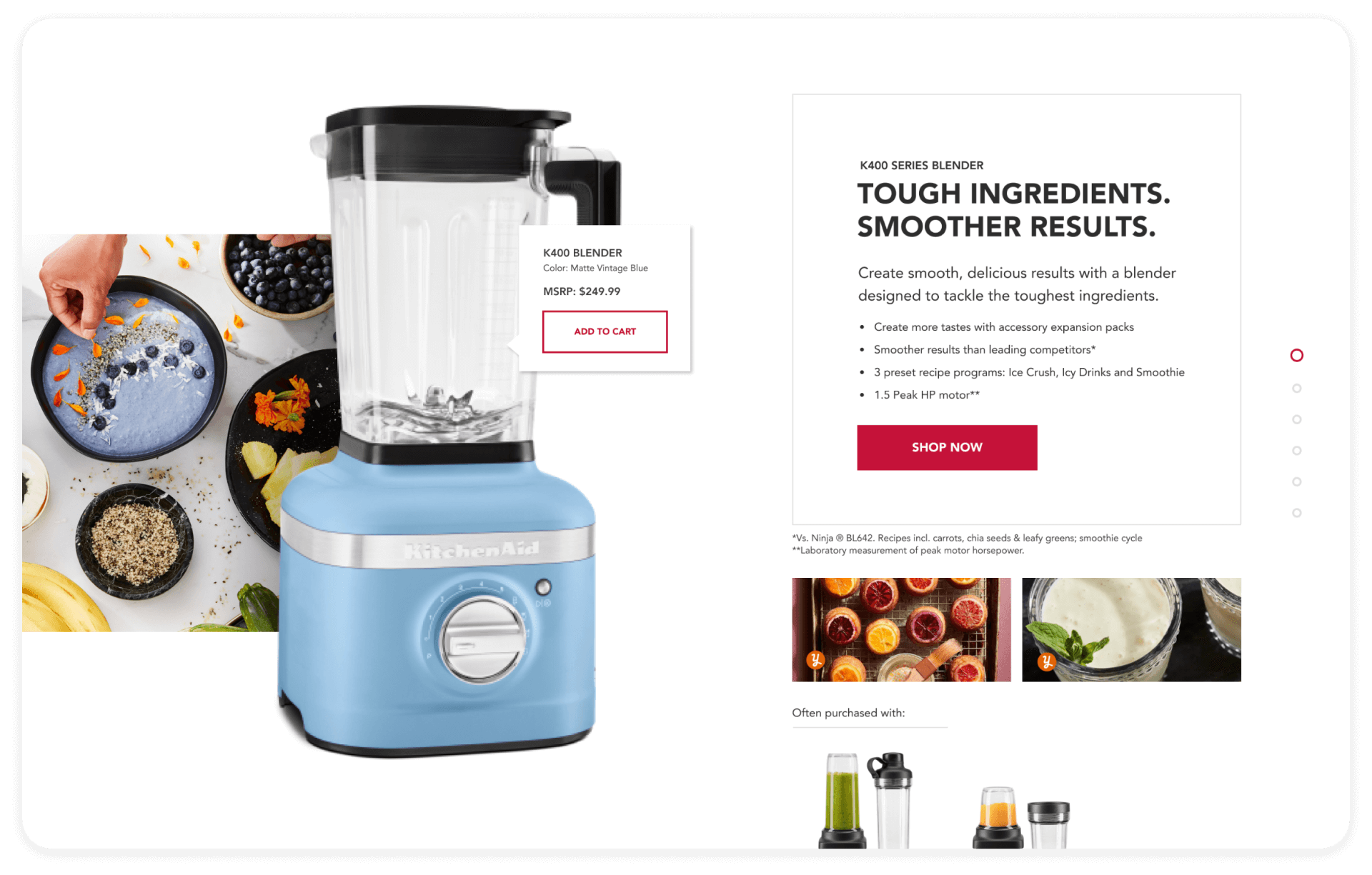
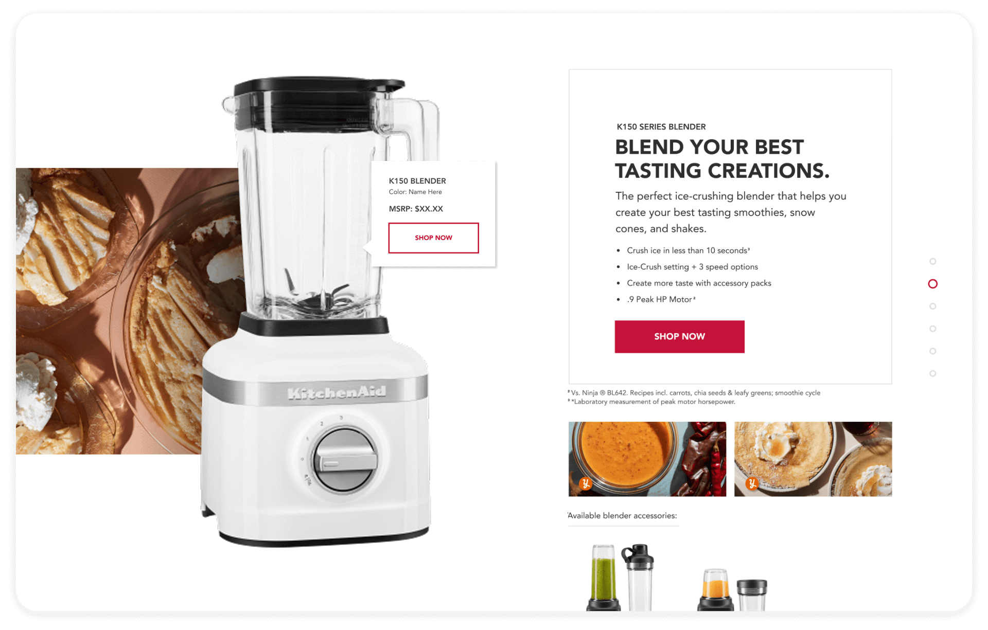
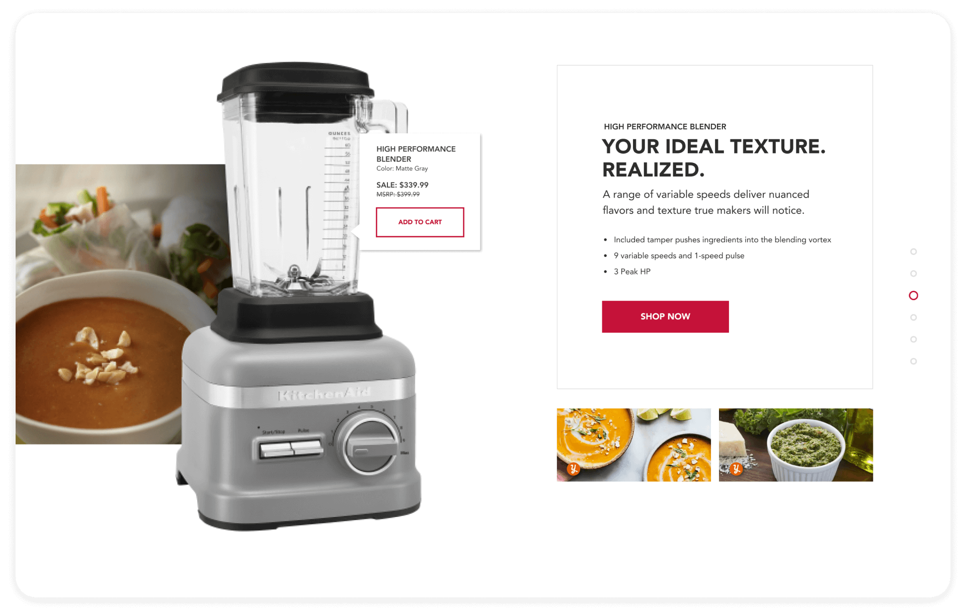
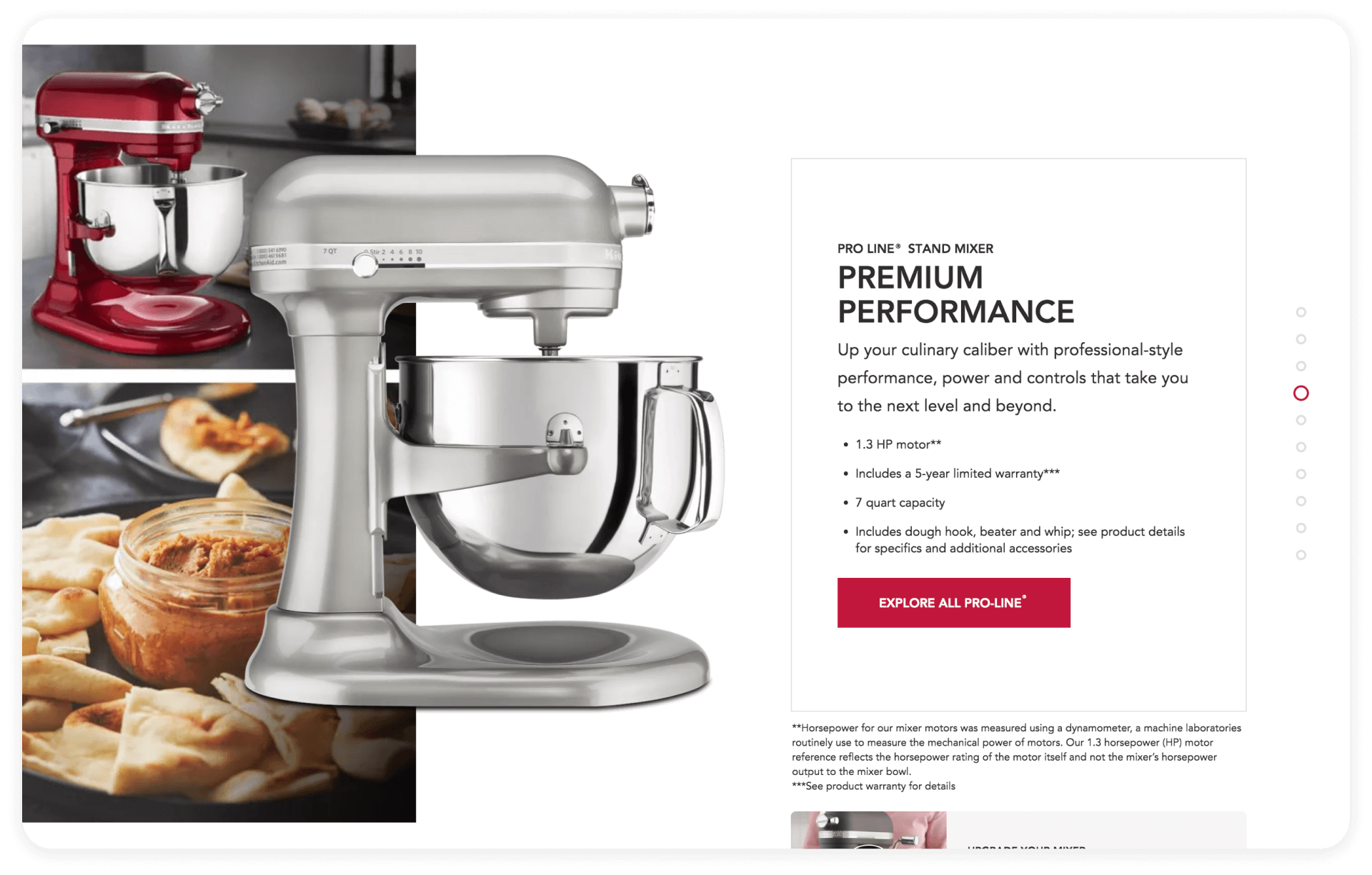
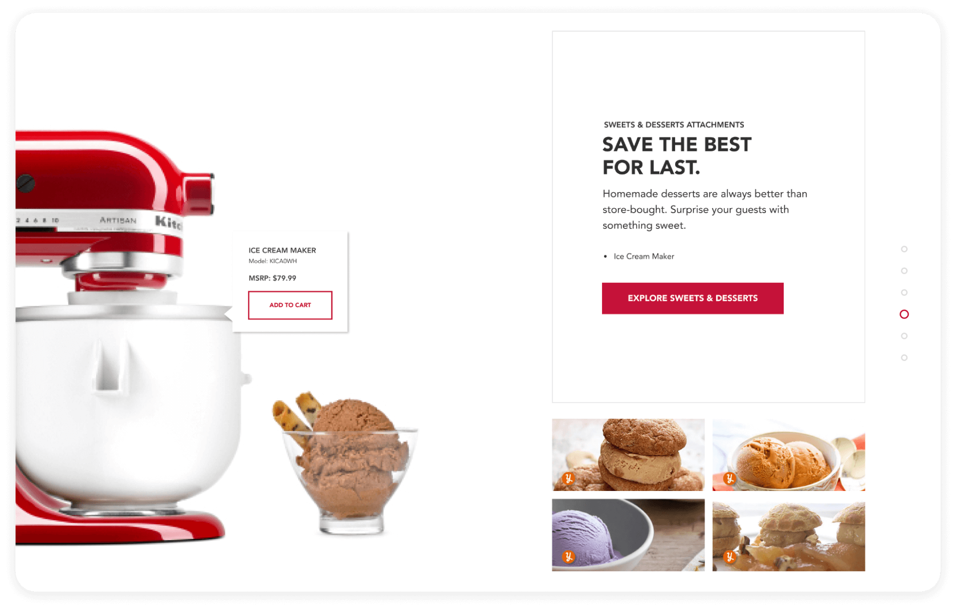
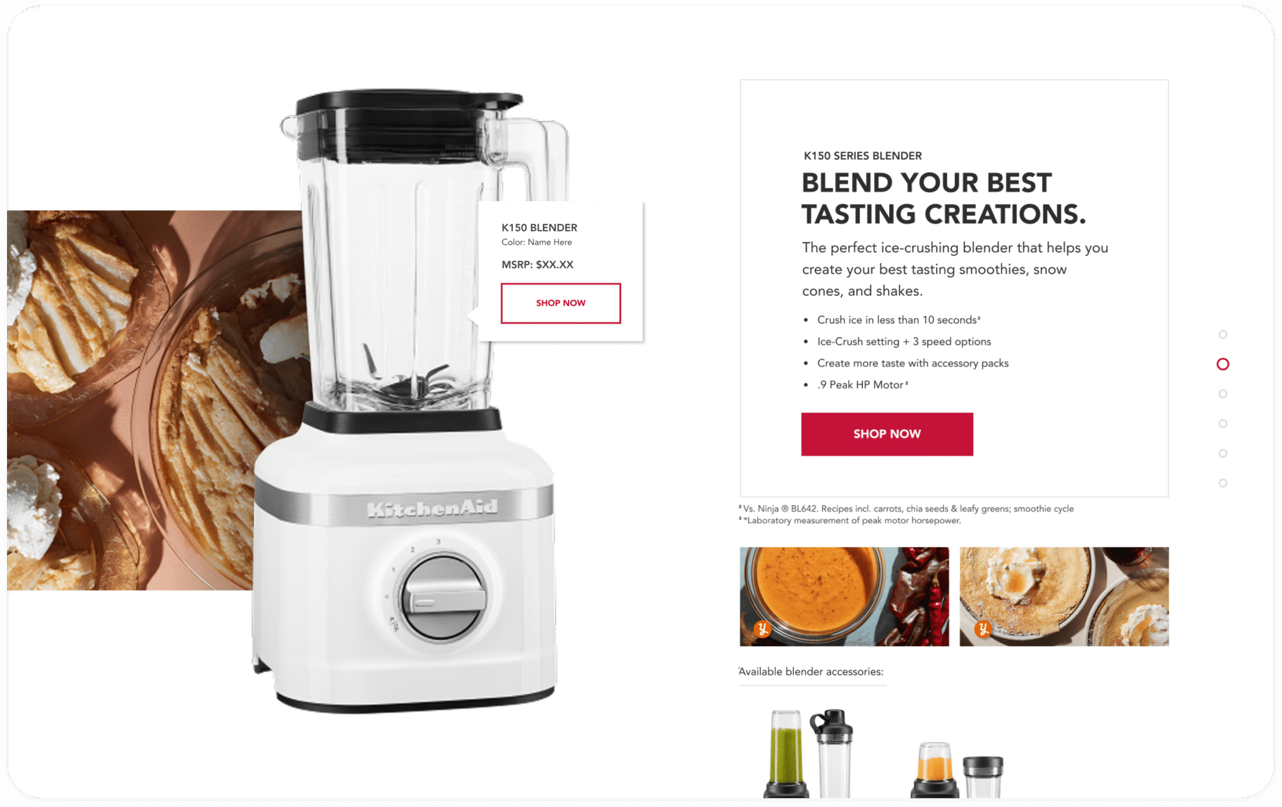
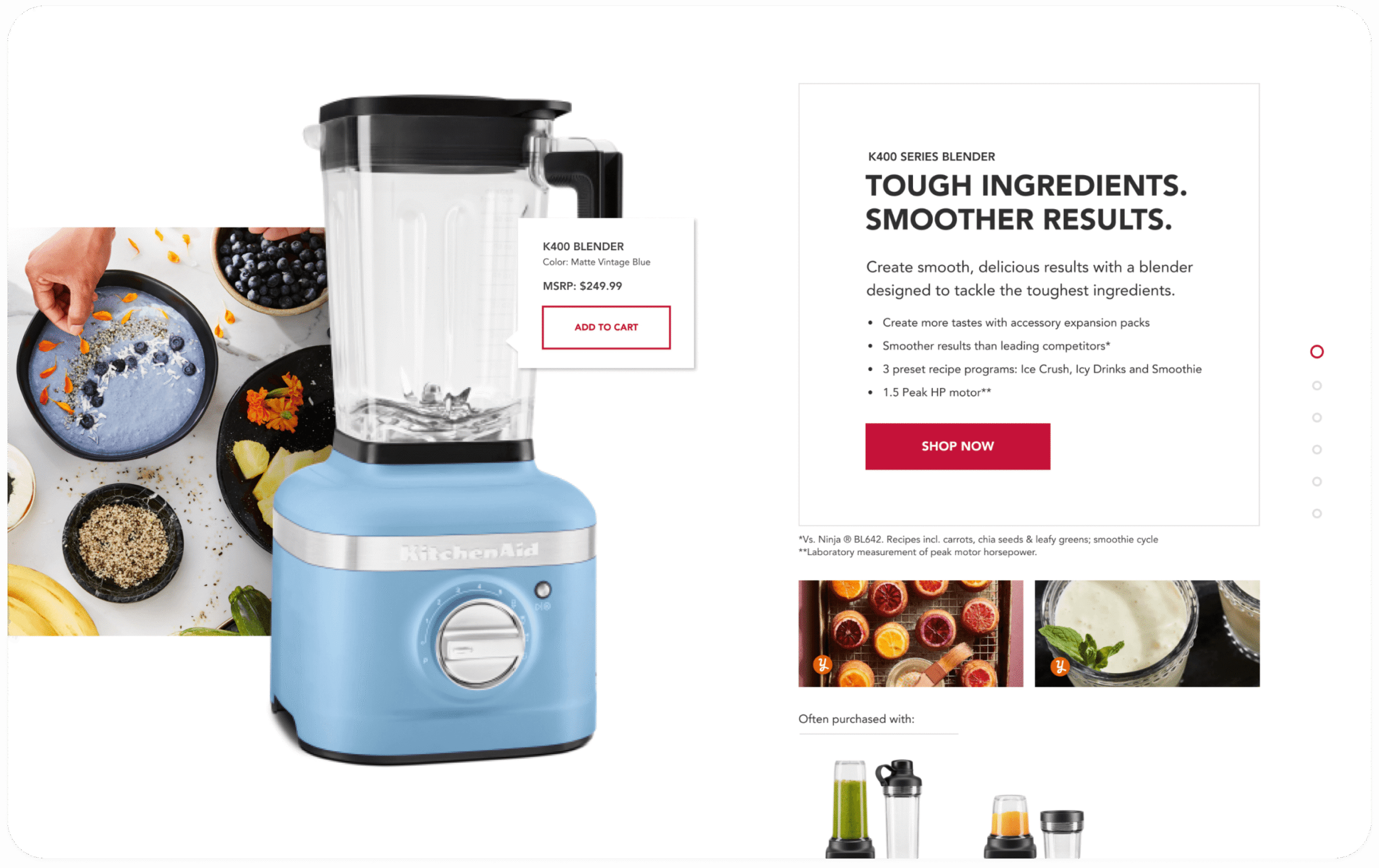
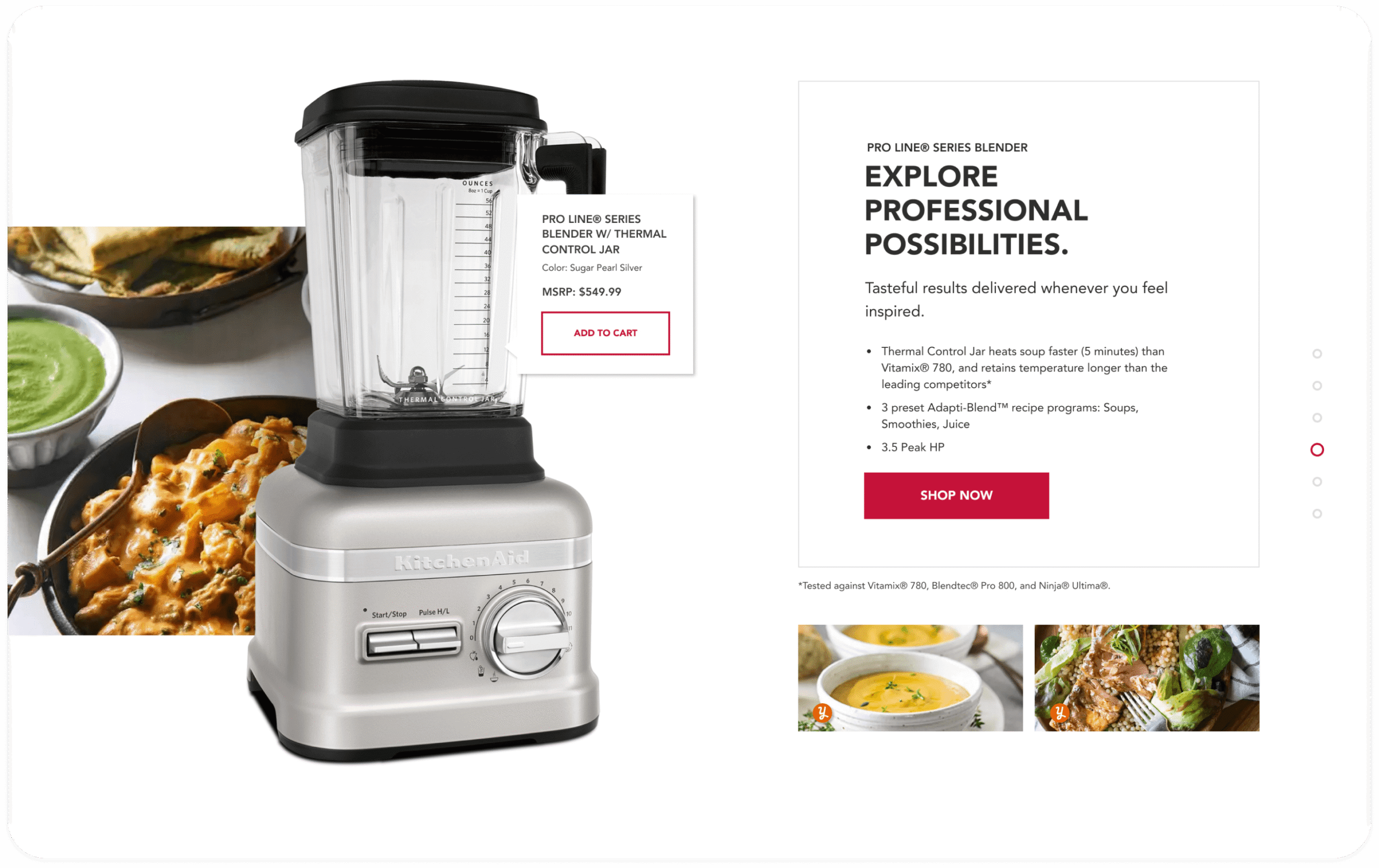
- Full visual execution comparing product lines in an editorial format with responsive, digestible product details.
- Design components that are able to adapt the entire KitchenAid collection of large/countertop appliances.
- Expand customer brand presence beyond countertop appliances, build information architecture with cross-product marketing opportunities.
Immediately increased e-commerce conversion rate by 143% and increased revenue by 193% by translating iconic point-of-purchase product strategy into a site-wide, long-term direct-to-consumer experience solutions for Stand Míxer.
Agency | Aisle Rocket (Chicago, IL)
2019
Design
Nicole Engle
Chelsey Dever
Copy
Peter Meersman
Connor O’Brien
Aaron Adams
Development
Adam Klemm
Mark Grismoukus
Chet Farley
Strategy
Joe Brodicki
Account
Jenna Halgen
Tess Babbit
Sarah Senour
View live experiences for KitchenAid's
BACKGROUND
An American
Tradition Since 1919
A legacy of loyal consumers
100 years after opening
Empathetic to the nostalgic connection, reimagine the brand’s voice with a modern digital experience. The KitchenAid customer is no longer the 1950s housewife making cookies!
For millennial homeowners, shopping for big life purchases happens on mobile instead of traditional point-of-puchase buying patterns. As much as we all loved significant trips to department stores, consumers are no longer pressured to spend hours agonizing over colors and features for a product that feels so societally defining..
Product ecosystem
Up next: Dishwashers: 48SKUs, 89.5K entries, 266K visits / Refrigerators: 108 SKUs 40K entries, 388K visits.
COMPETITION
E-commerce landscape
For a product as meaningful as the Míxer, the D2C experience translates the brand essence and the customer experience in a digital space: expanding customer loyalty to an entire line of products, and a new generation of makers.
APPROACH
Project goals
- Create an accessible, responsive experience within Adobe Experience Manager.
- Communicate a more educational luxury experience – give users a reason to trust us over third party competitors.
- Maximize brand presence across all products and brand touchpoints by communicating the nostalgic vibe for loyal customers and welcoming new inspiration.
- Design a component system that can be easily updated to adapt to changes in strategic priorities of user needs and buying patterns – and can be applied to product categories site wide.
- Expand brand presence beyond countertop appliances, build information architecture with cross-product marketing opportunities.
PROCESS
Enhance brand digital presence,
beyond the míxer
Translating user needs with rich adaptable cross-product story architecture.
High impact storytelling
Functional base design outshines third party customer purchasing experience: able to adapt to morphing strategic and brand goals for an array of products. The component based experience is intended to support and grow with an entire line of KitchenAid products in the future (Total: 752 SKUs / 322K entries).
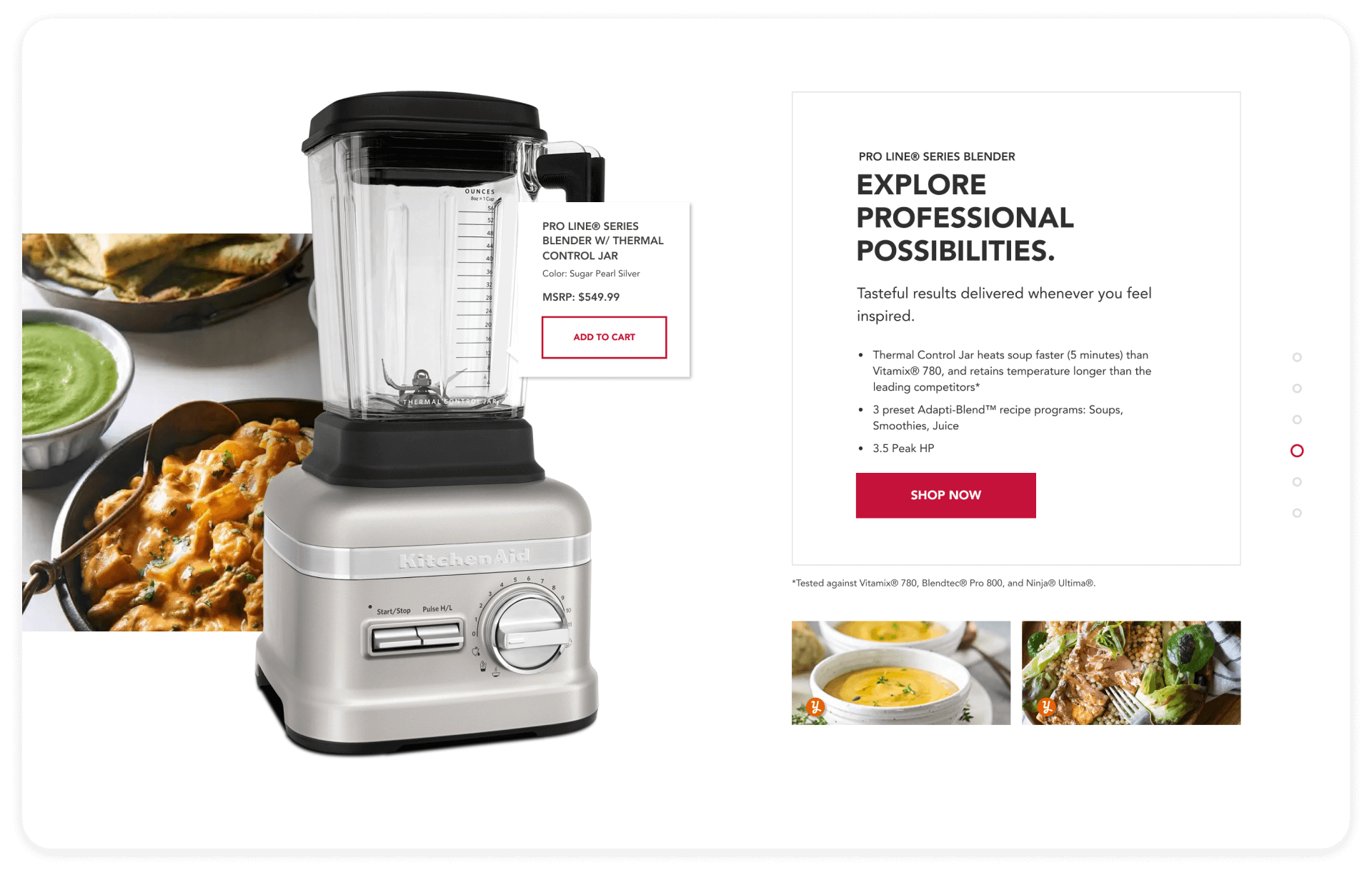
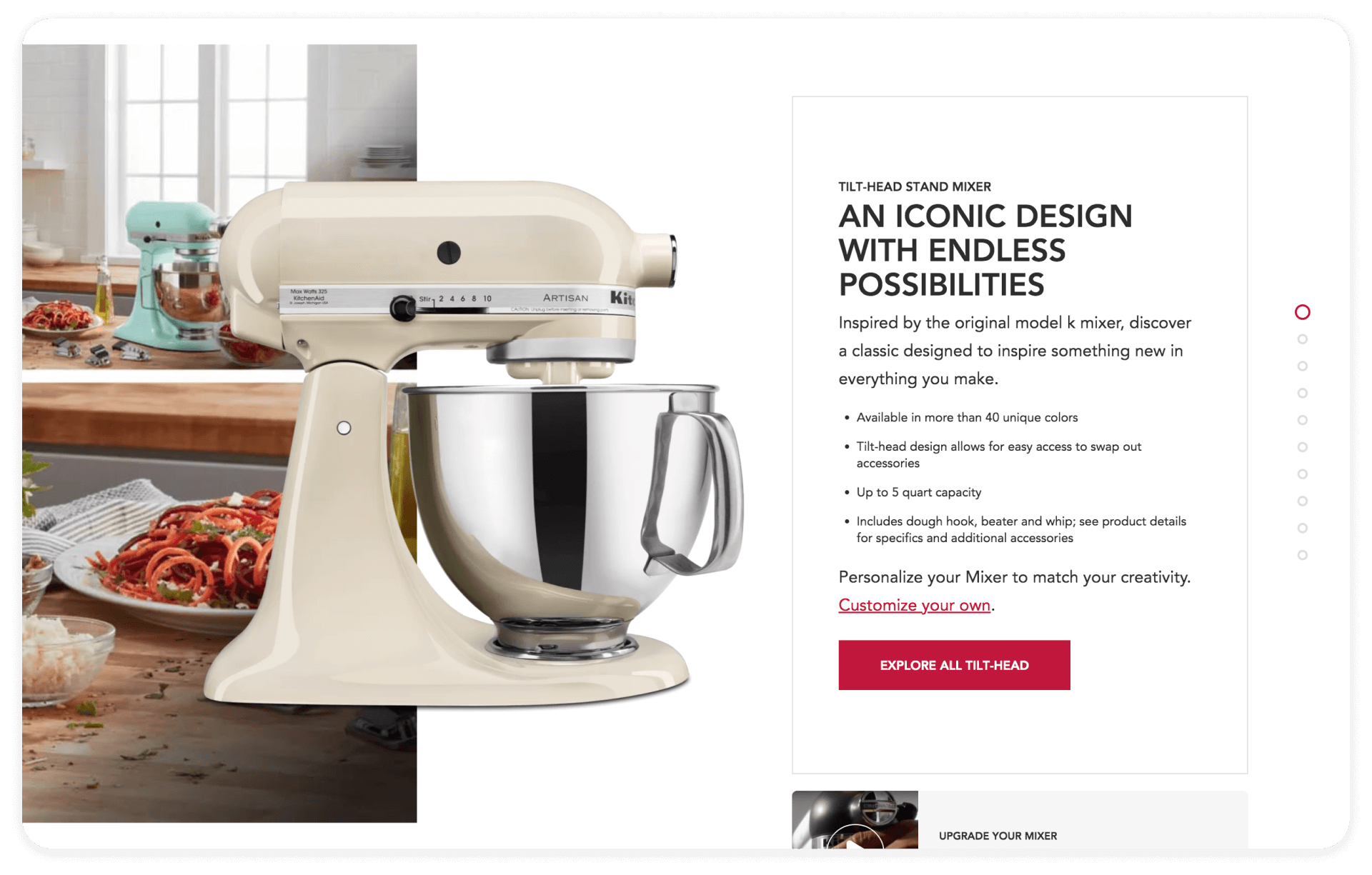
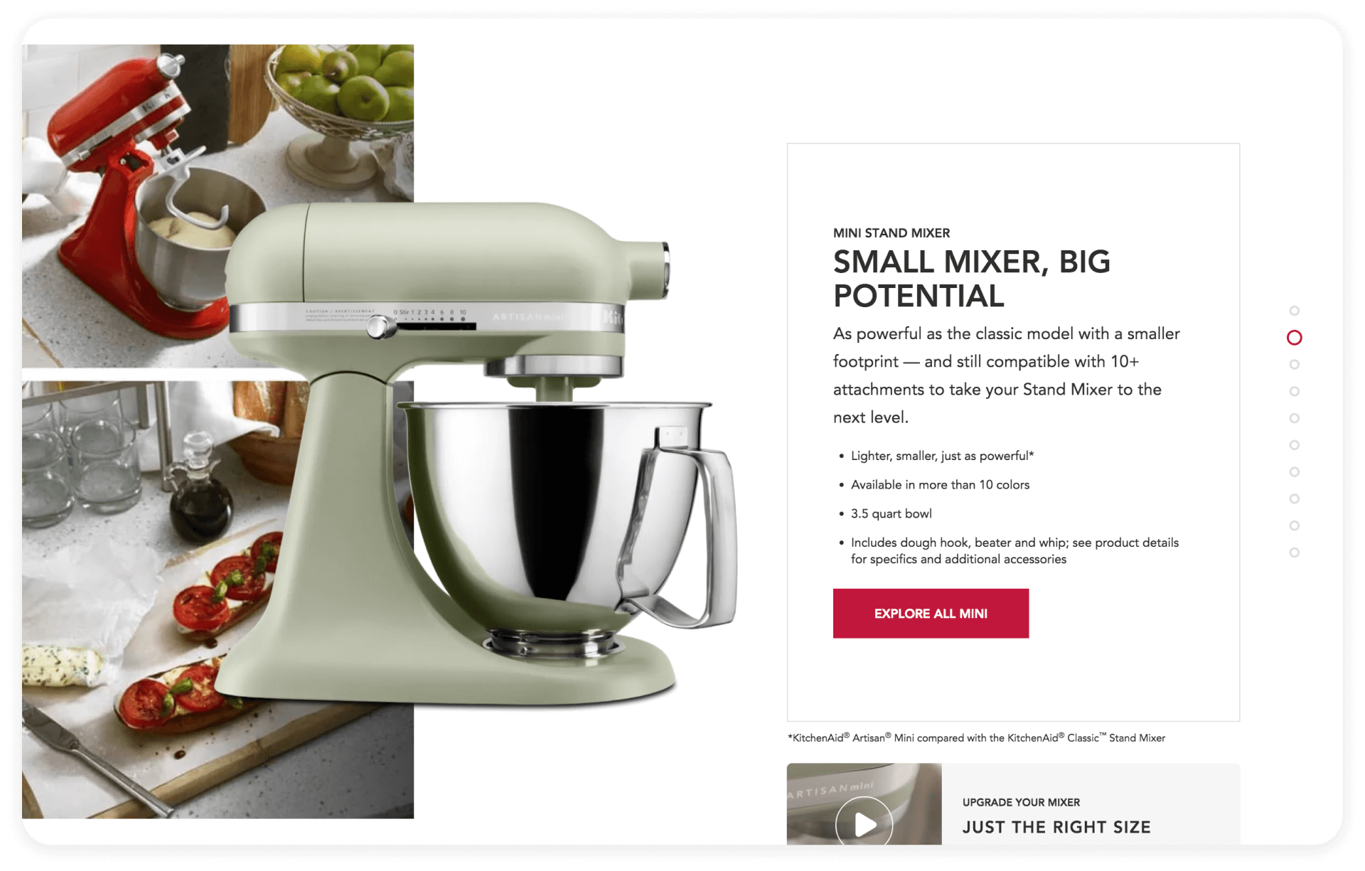
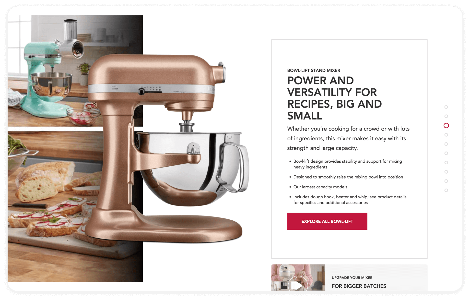
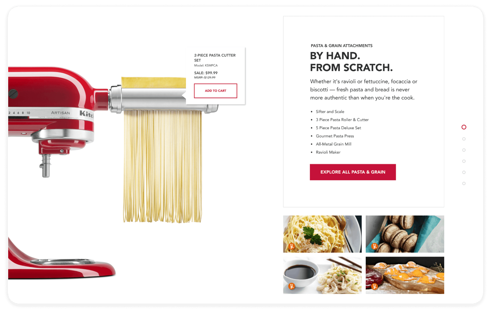
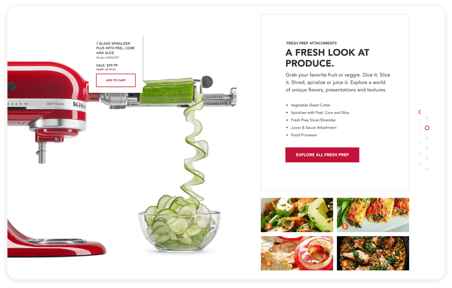
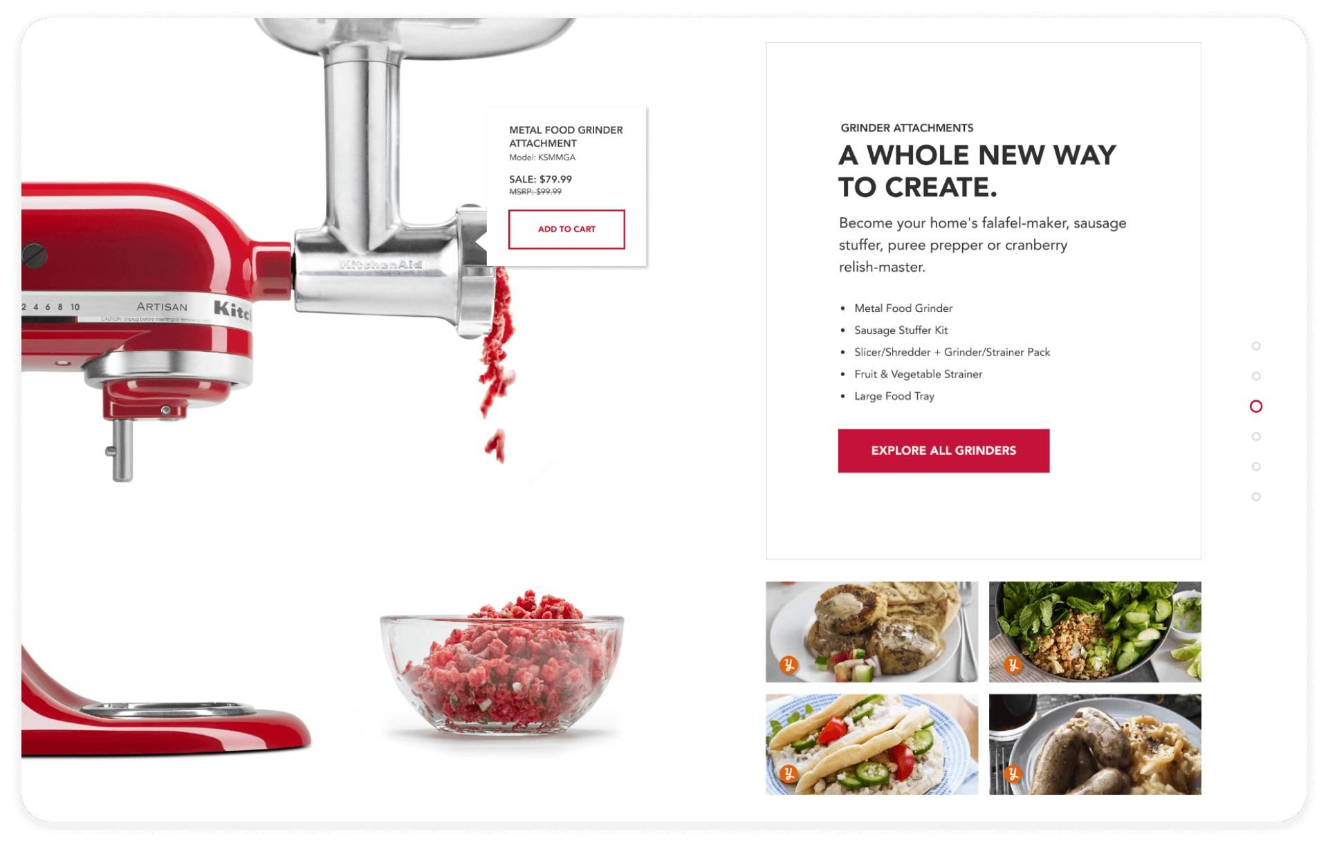
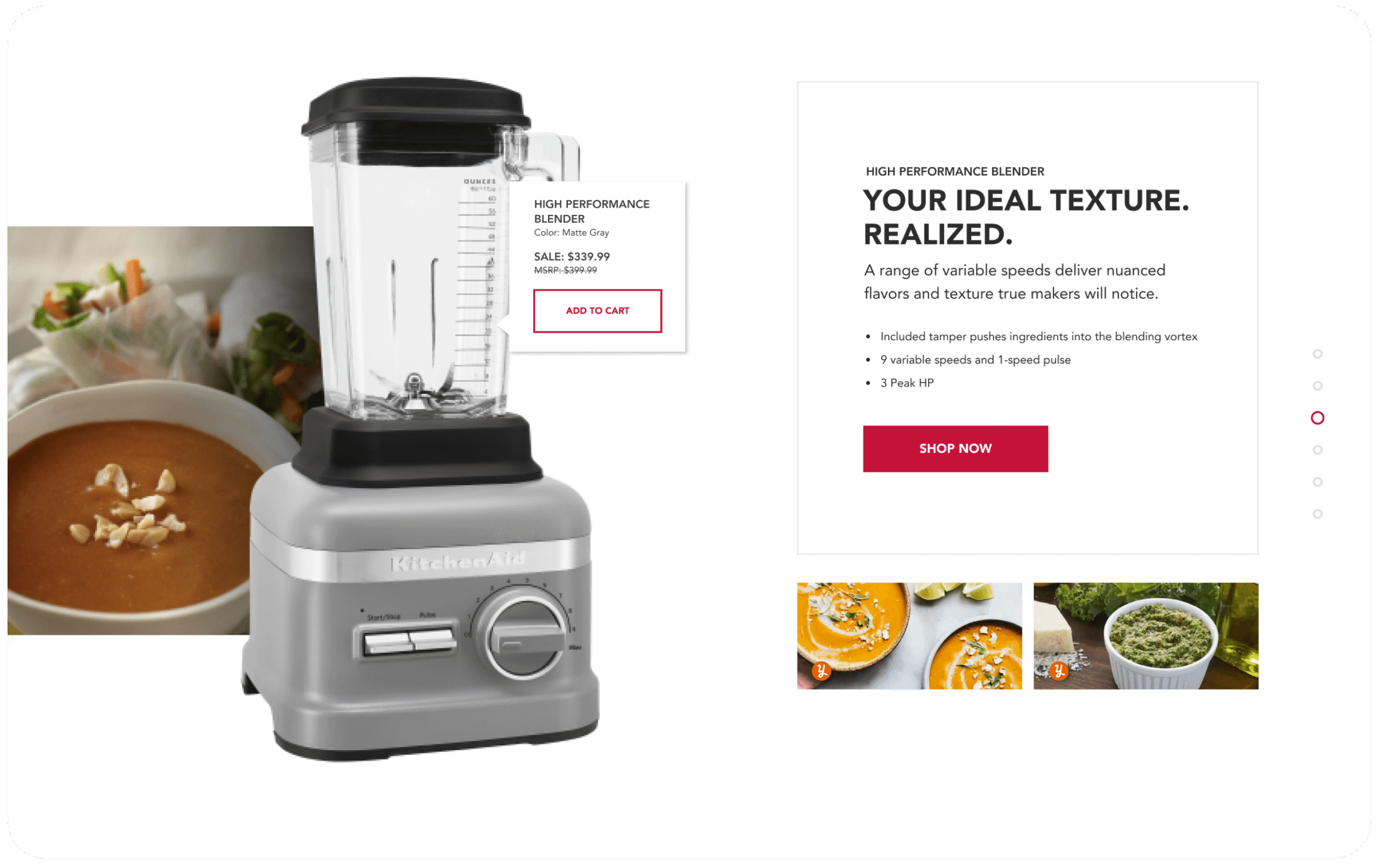
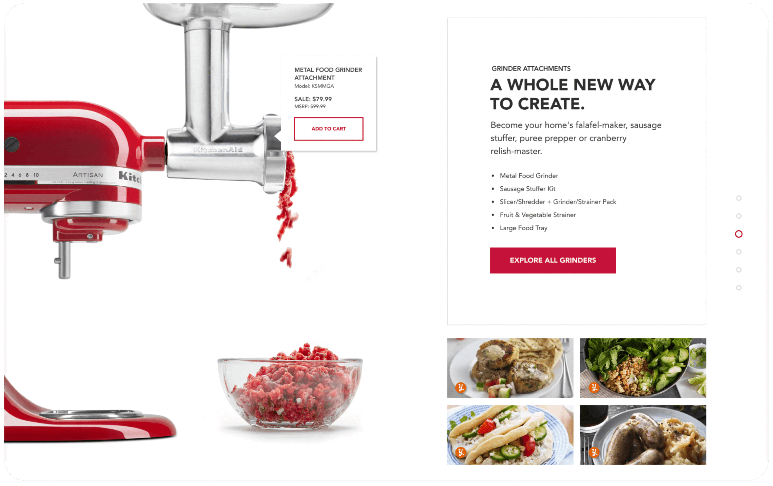
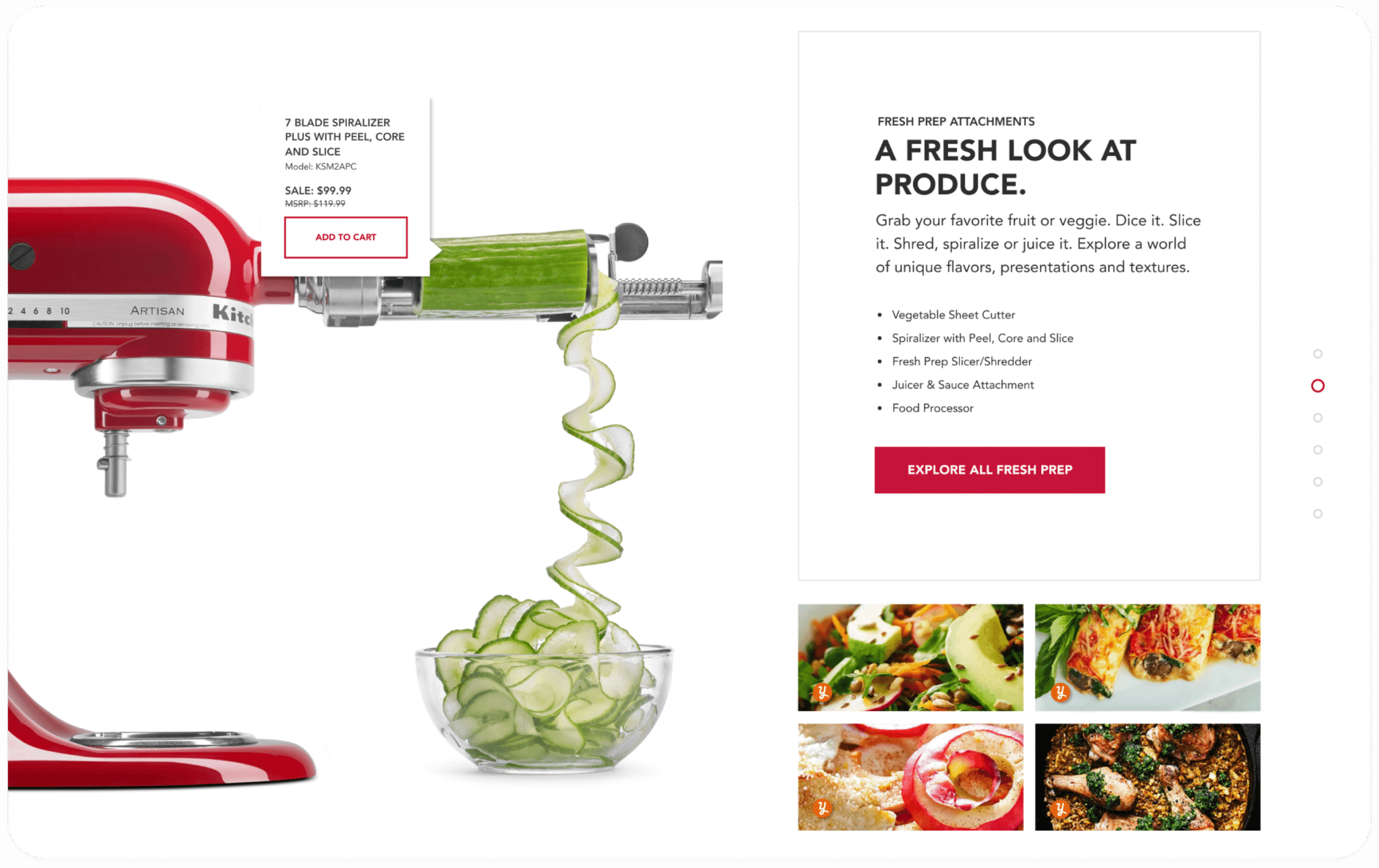
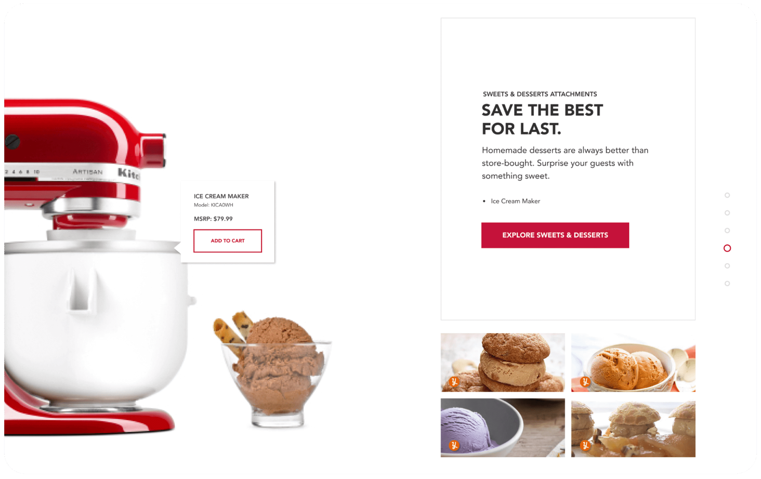
Adaptable category experience with fully fleshed story architecture for Stand Míxers: 175 SKUs/388k entries/766k visits, Attachments: 39 SKUs/339k entries /673k visits, and Blenders: N/A (experience did not exist prior to gauge).
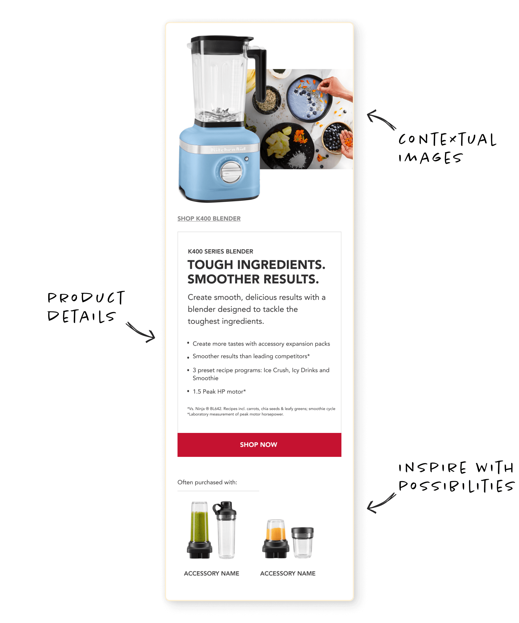
Creating context
Effortlessly compare entire categories of products with scannable information architecture, enabling users to make the most informed decision. Built on the brand pillars, the design has the ability to adapt to any KitchainAid product story, resonating with user interests in a cohesive way.
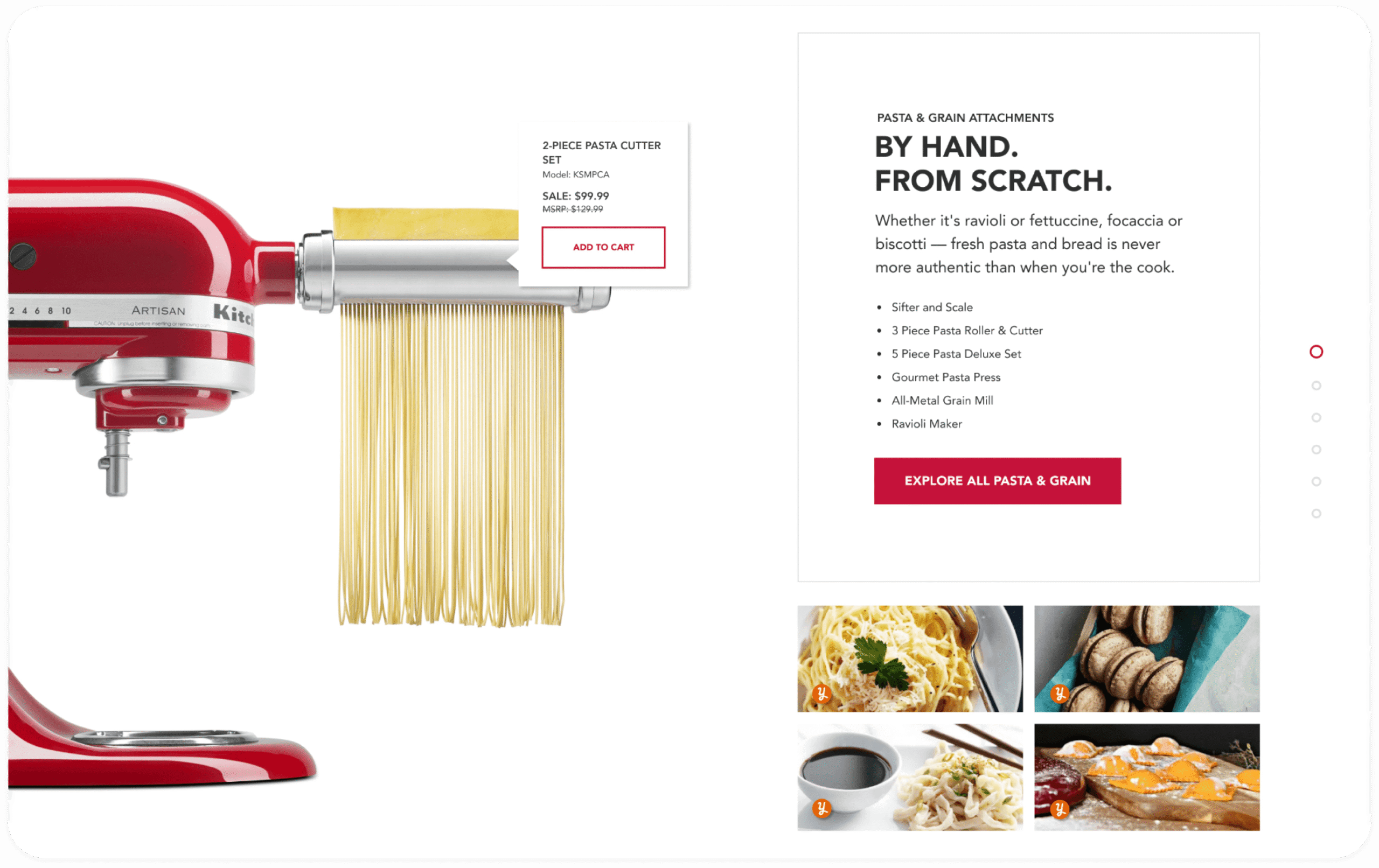
Beyond basic product details, every member of the brand family has an opportunity to shine with a contextualized, in-depth understanding. Through user-minded visuals and empathetic product detail hierarchy, the components bring context to possibilities via accessories, recipes, maker moments and beyond.
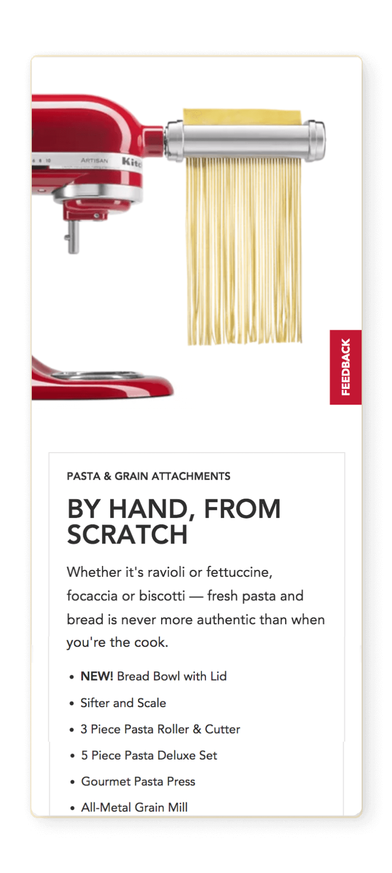
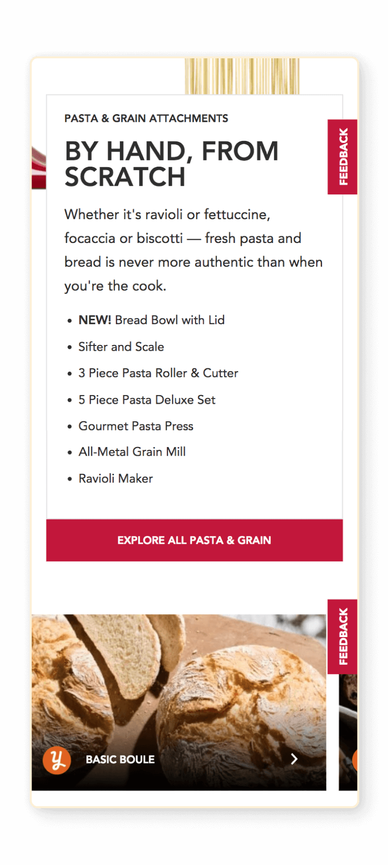
Opportunities to inspire
Lux direct to consumer experience builds trust: outreaching point-of-purchase, empowering users with timeless evergreen experiences and hubs of inspired product information. Ability to tell brand stories on a digital scale like never before – built in Adobe Experience Manager, the design system armors KitchenAid brand teams to amplify the maker message on a responsive, global scale.
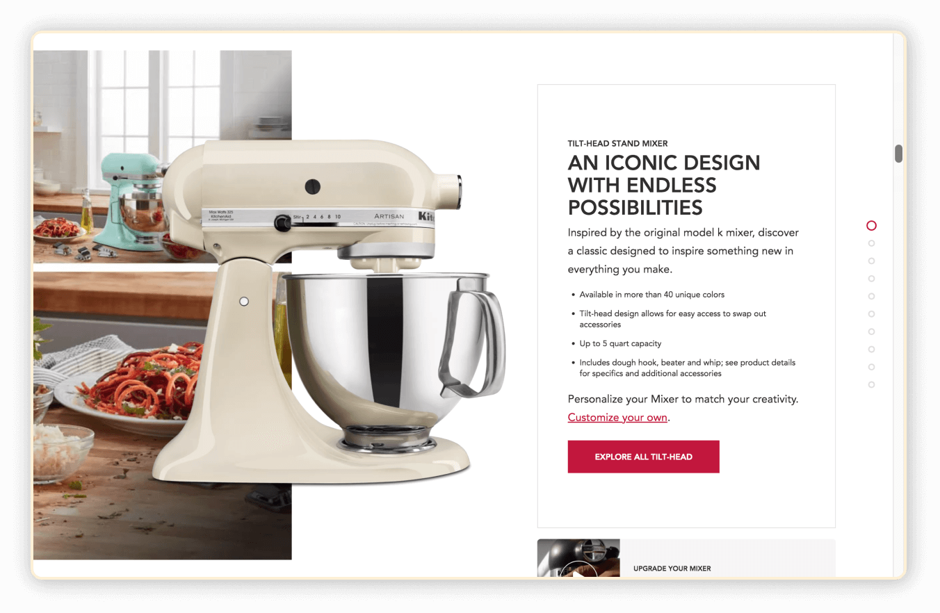
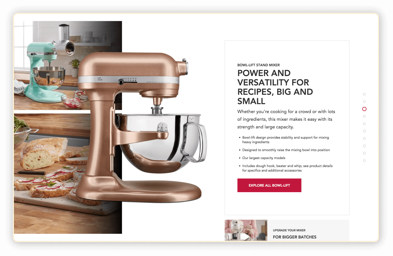
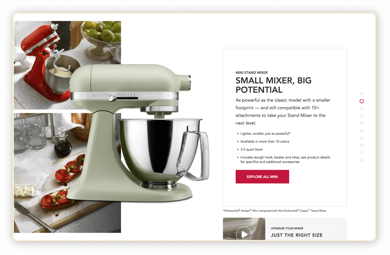
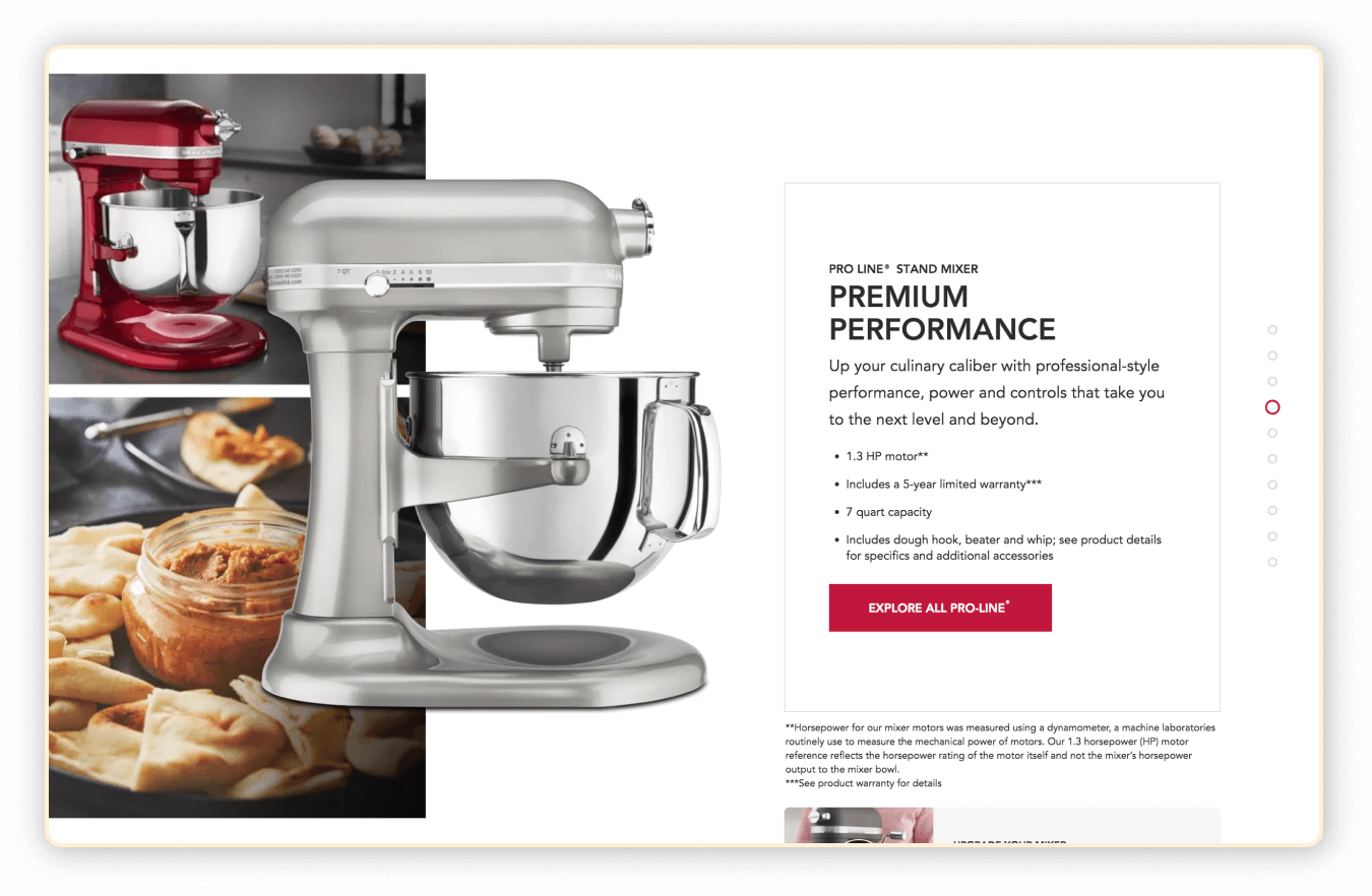
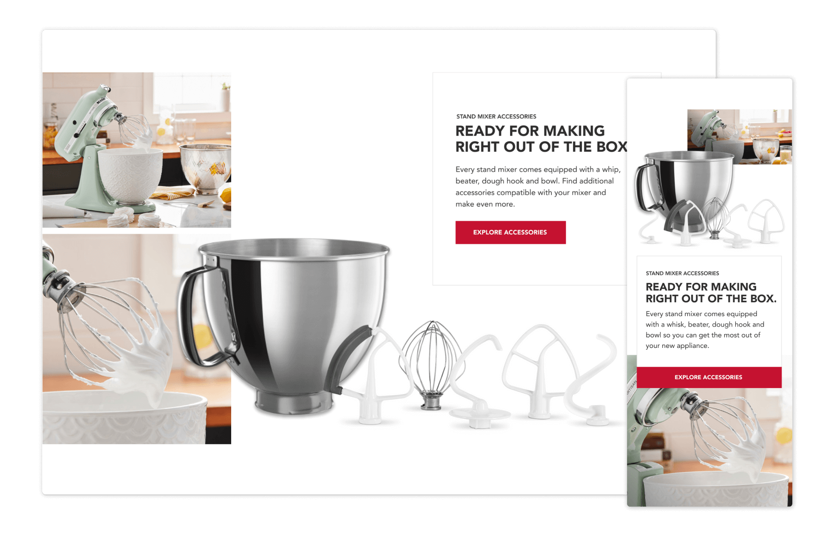
The foundation adapts to tell a range product stories: from legacy appliances, to seasonal updates and fresh trend releases. The components also equip all sectors of the brand/sales team to update experiences with business strategies and priorities; conduct user testing, A/B testing, cross promotion and brand awareness – interacting with users in impactful instances.
RESULTS | POST LAUNCH METRICS
Compared to
prior Black Friday
STAND MlXERS
+143%
Ecommerce conversion rate
* 11/13 to 12/8 of 2019 compared to 11/7 to 12/2 of 2018
-13%
Bounce rate
+193%
Orders
+197%
Revenue
ATTACHMENTS
+192%
Ecommerce conversion rate
* 11/13 to 12/8 of 2019 compared to 11/7 to 12/2 of 2018
+12%
Orders
+24%
Revenue
+11%
Revenue per order
BLENDERS
Sold Out
Before Black Friday
Upon closer investigation from the team, we discovered the page release sold out all blenders before the Black Friday rush, causing the number flub.
-26%
Bounce rate
+67%
Revenue
+134%
Revenue per order
