
Subscription Tier Selection
SAAS Modal Redesign
| Neat Pulse’s B2B E-commerce
Subscription Tier Selection
SAAS Modal Redesign
| Neat Pulse’s B2B E-commerce

OBJECTIVE
Reducing decision friction at a critical SAAS conversion point.
Role | UX Designer
Led the strategic redesign of Neat Pulse's subscription tier interface, identifying and solving critical usability issues through heuristic evaluation and comparative analysis.
Implemented progressive disclosure framework serving both quick decision-makers and detail-oriented researchers. Balanced business conversion goals with user autonomy through interactive hover states and expandable comparison tools.
Creating frictionless decision pathways while maintaining comprehensive information access.
Context
Neat is a B2B video conferencing company; and Neat Pulse is their cloud-based management platform—giving IT administrators centralized control over video collaboration devices with remote management, automatic updates, live status reporting, and integrated business apps bundled with premium support options.
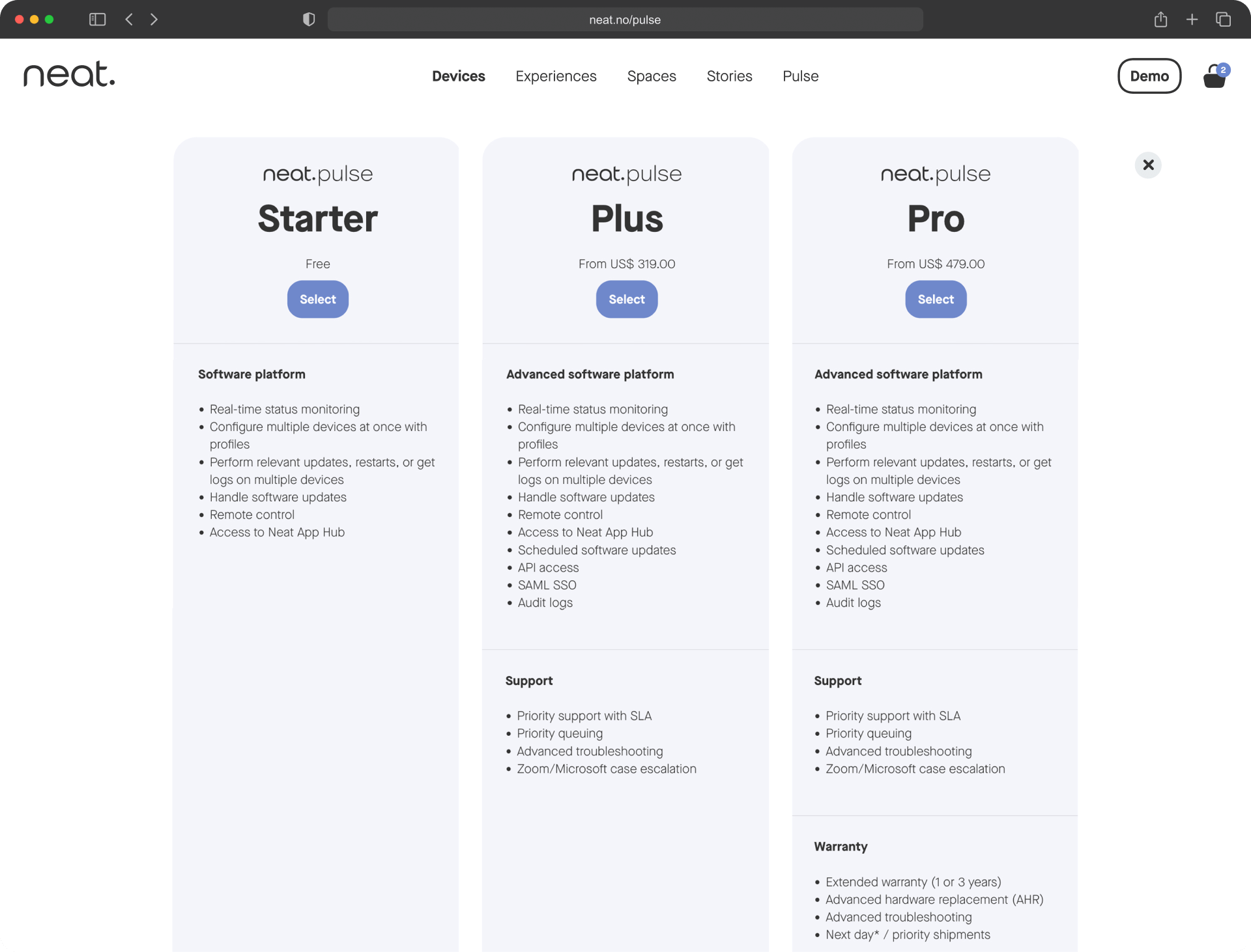
The challenge: Three tiers (Starter, Plus, Pro) with increasingly comprehensive features. The interface needed to help IT decision-makers quickly understand differences while providing detailed comparison for stakeholder buy-in.
Company
Neat.no
2025
Industry
Video collaboration
Hardware/software
Scroll to explore the analysis and redesign for Neat Pulse


PROCESS
One interface, serving two user mindsets.
Eliminating ambiguity without overwhelming casual browsers.
Identifying critical friction points
Heuristic evaluation against SaaS pricing best practices revealed four barriers creating decision paralysis:
- Excessive cognitive load: 1,100px vertical space forcing constant scrolling
- Poor scan efficiency: "Feature subtraction" mental model requiring users to deduce what's different
- Inheritance ambiguity: No indication if higher tiers included lower-tier features
- Viewport inefficiency: Only 1.5 tiers visible simultaneously
The original design forced users to process 100+ disconnected data points across category sections. Single view couldn't serve both quick decision-makers and thorough researchers.
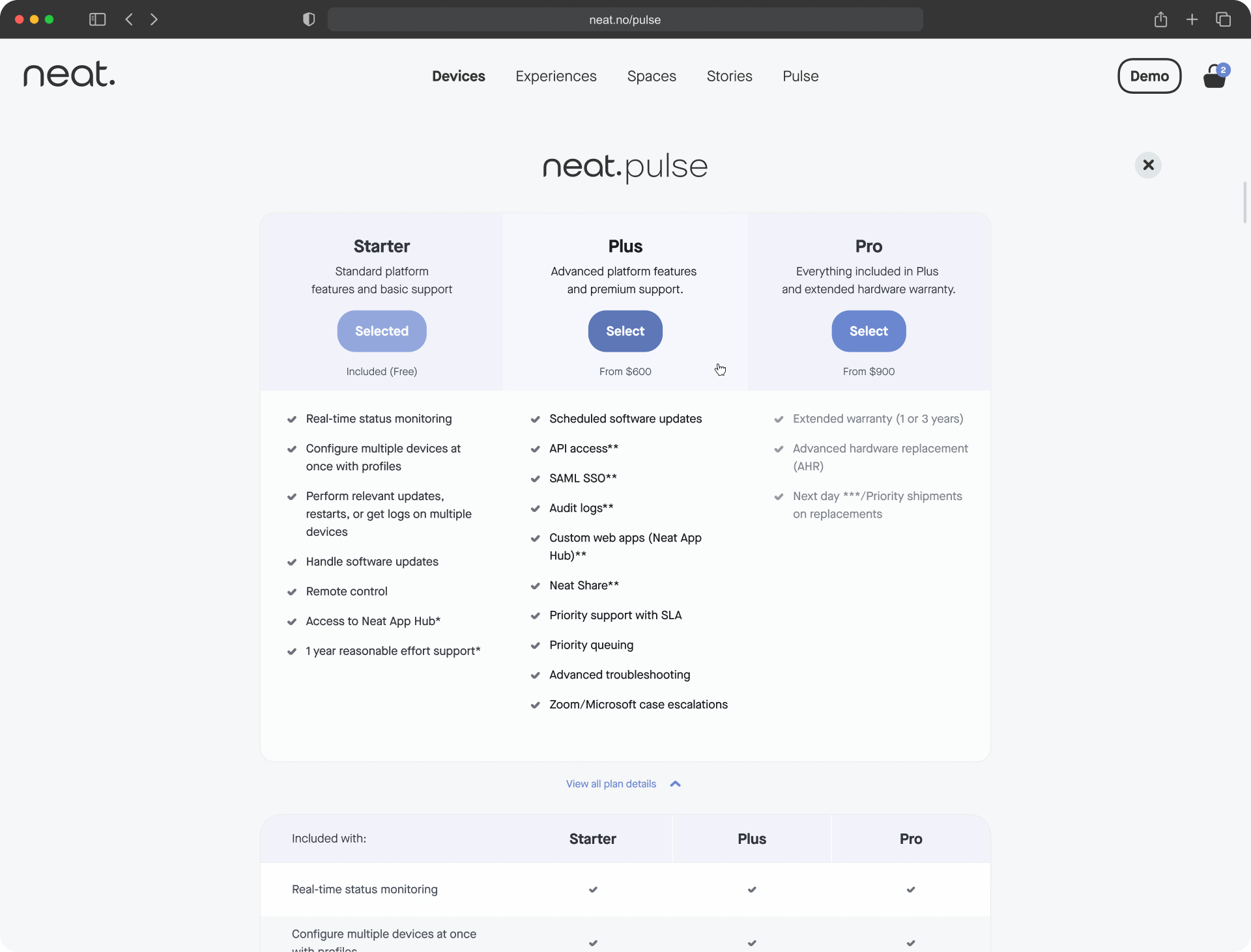
Original (left), Redesign (right)
Streamlined visual hierarchy & vertical space
Restructured information architecture for maximum scannability.
Space optimization:
- Reduced from 1,100px to 450px (59% reduction)
- All three tiers, pricing, and CTAs visible simultaneously
- Eliminated scroll-and-remember comparison patterns
Content simplification:
- Asterisks reduced from 12 to 1 (92% reduction)
- Footnotes consolidated from 3 to 1
- Default view shows 8-10 key features vs. 35-40 previously
- Users process 30 data points initially vs. 100+ (70% cognitive load reduction)
Interactive hover states
On-demand interaction design answering: "What exactly am I getting?"
Hover over Pro tier → see visual confirmation of all Starter features + all Plus features + Pro exclusives. Eliminates feature inheritance ambiguity without cluttering the interface.
Users shift from "I think Pro includes everything..." to "I can see that Pro includes everything." Reduces purchase anxiety and post-decision regret.
Progressive disclosure through dual-mode interface
Two distinct pathways serving different user needs.
Expandable "View all plan details" section lets users choose their information depth. Each user gets exactly the experience they need.
- Quick Scan (Default): Clean layout, key features only. 80% of users make fast decisions in 10-15 seconds.
- Detailed Matrix (Expandable): Comprehensive 25+ feature comparison table with checkmark matrix. 20% of users conducting due diligence get thorough analysis on-demand.
Expandable "View all plan details" section lets users choose their information depth. Each user gets exactly the experience they need.

Mobile-First Optimization
Collapsed default view inherently mobile-friendly.
Original design: ~3,000px+ vertical scrolling on mobile—extremely poor experience.
New design: Manageable ~600-900px stacking, hover states convert to tap, expanded matrix uses horizontal scroll. Mobile-optimized pricing typically sees 20-30% conversion improvement over poorly adapted designs.
RESULTS | PROJECTED IMPACT BASED ON UX BENCHMARKS
Reducing cognitive load while increasing information accessibility.
INFORMATION ARCHITECTURE
All tiers visible simultaneously
Eliminated scroll-and-remember patterns
30 vs. 100+
Data points initially
70%
Reduction in cognitive load
59%
Reduction in vertical space
MORE FEATURED WORK


LET'S CONNECT
NICOLE ENGLE
UX, UI, CX Designer
Specializing in ecommerce solutions.
Currently creating in Chicago, IL.
